In Power BI, report authors can use themes in reports to keep the color palette consistent across visualizations. Let’s look at how to use themes.
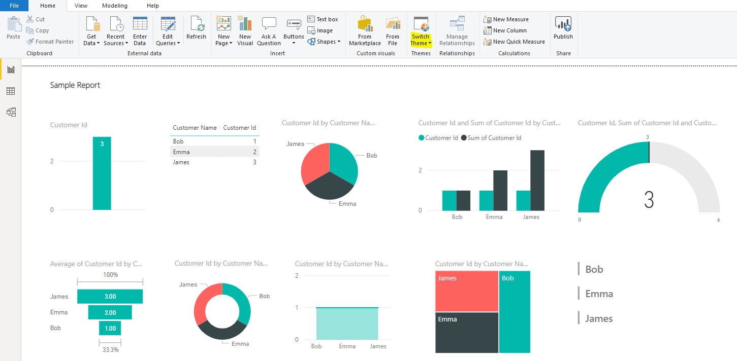
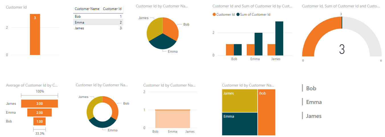
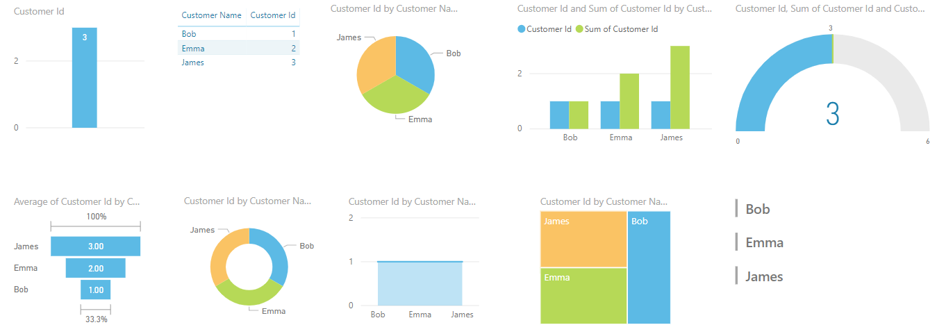
Below is a pretty simple report. Note in the navigation bar there is the Switch Themes button:
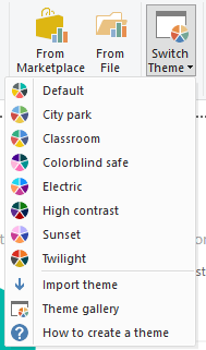
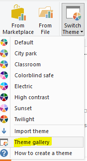
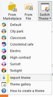
Clicking it, we see there are several themes available, including:
- Default
- City park
- Classroom
- Colorblind safe
- Electric
- High contrast
- Sunset
- Twilight
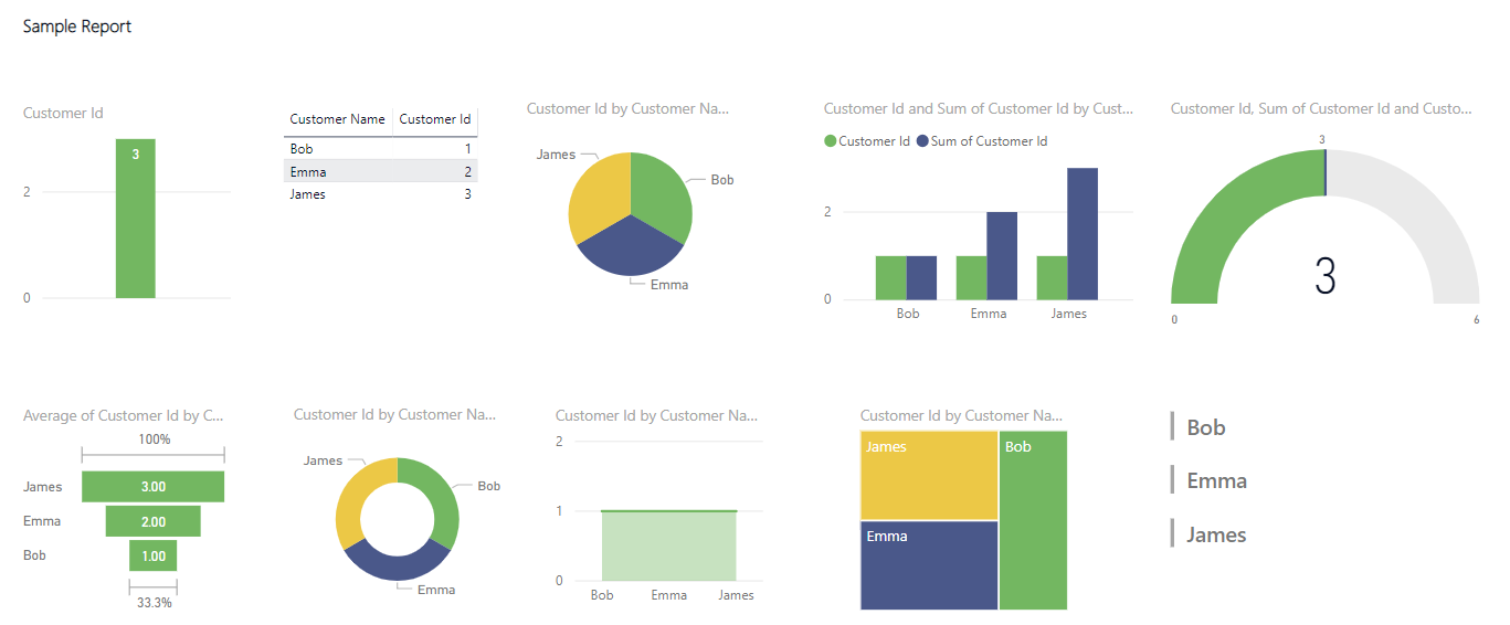
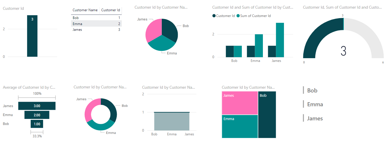
We are currently set to the default theme. Let’s change to City park. Note that the colors of each visualization change:
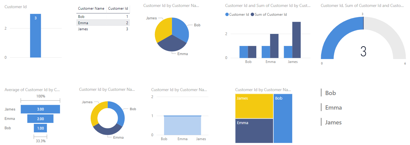
Let’s look at the other themes.
Classroom:
Colorblind Safe:
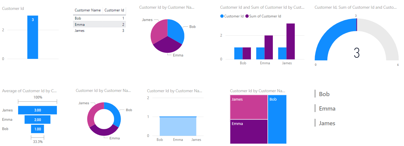
Electric:
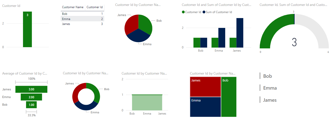
High Contrast:
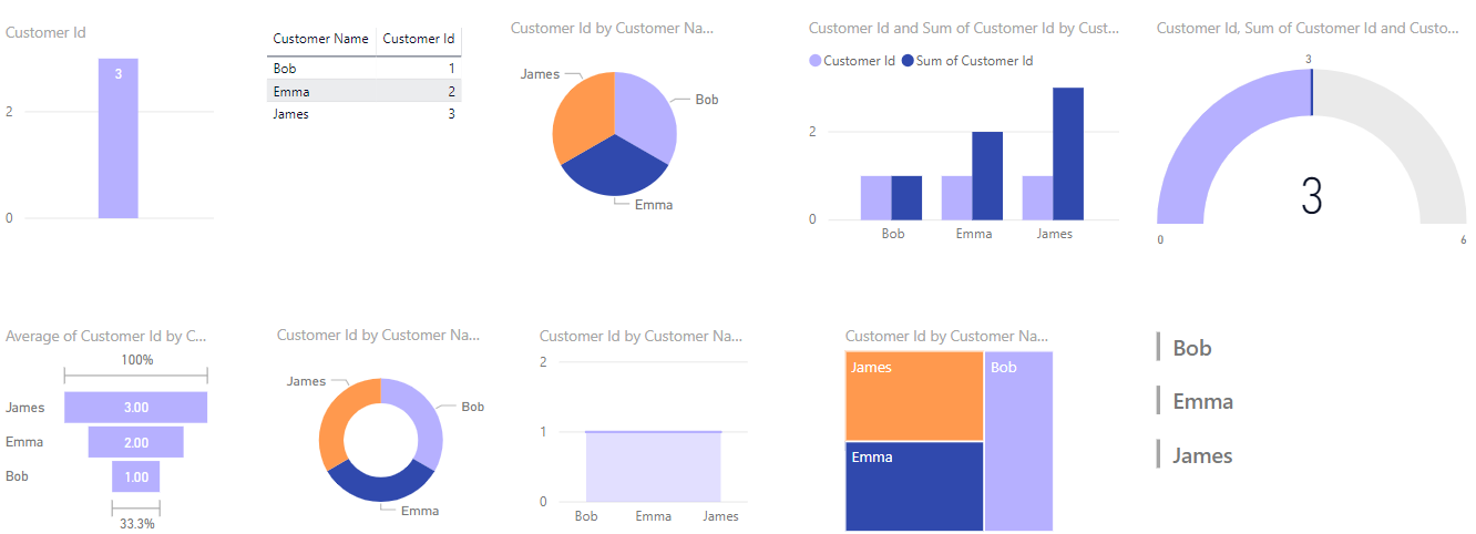
Sunset:
Twilight:
Themes are available from the Theme Gallery, located at https://community.powerbi.com/t5/Themes-Gallery/bd-p/ThemesGallery:
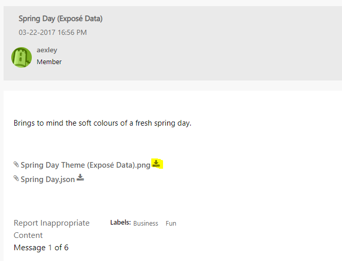
To install a theme, select it:

Then find the JSON file and download it:
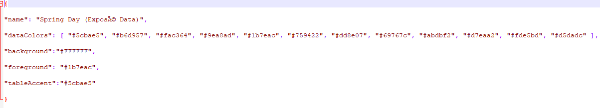
The JSON file defines the colors for the theme:
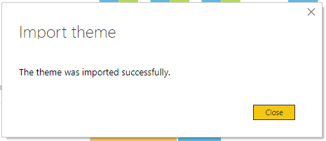
Back in Power BI Desktop, select to Import the theme:
Select the downloaded JSON file. The theme will be imported:
And installed:
To create your own theme, follow the same format in a JSON file with your own color scheme. It’s an easy way to apply a consistent look to corporate reports.
I AM SPENDING MORE TIME THESE DAYS CREATING YOUTUBE VIDEOS TO HELP PEOPLE LEARN THE MICROSOFT POWER PLATFORM.
IF YOU WOULD LIKE TO SEE HOW I BUILD APPS, OR FIND SOMETHING USEFUL READING MY BLOG, I WOULD REALLY APPRECIATE YOU SUBSCRIBING TO MY YOUTUBE CHANNEL.
THANK YOU, AND LET'S KEEP LEARNING TOGETHER.
CARL