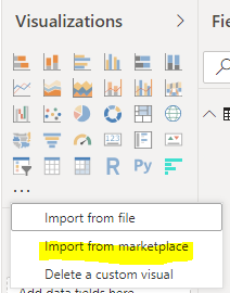
The Horizontal Bar Chart is a Power BI visualization from Microsoft. To install it, in Power BI Desktop, select Import from Marketplace:
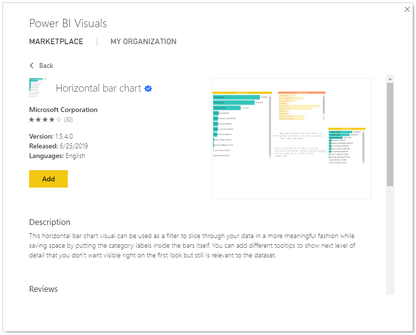
Click Add:
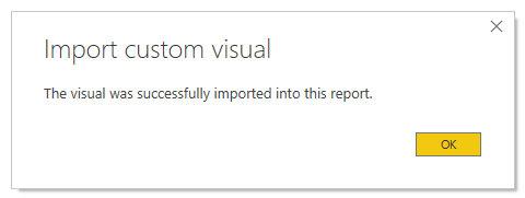
Click OK:
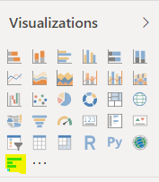
You will see the new visualization added:
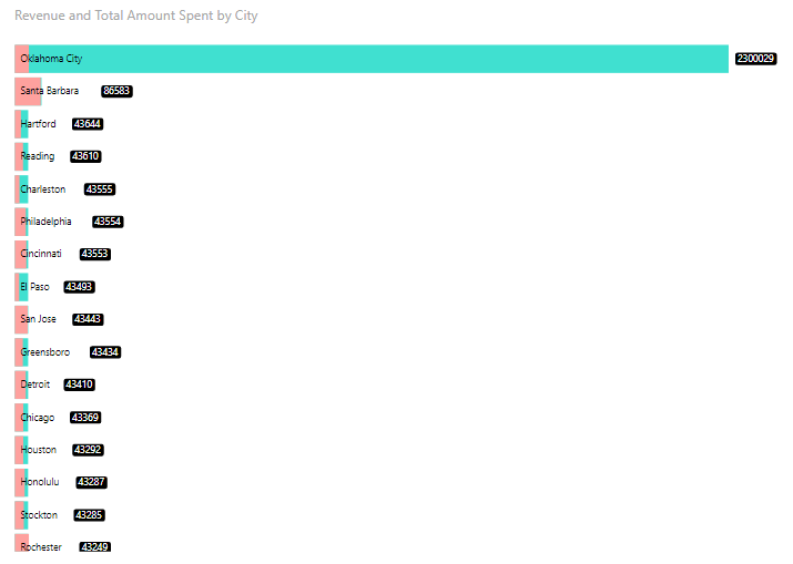
Let’s add some fields. We have a Revenue field and Total Amount Spent field. Let’s look at these by City:
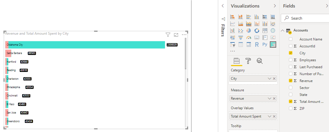
We can see the visualization is useful in comparing values:
THANKS FOR READING. BEFORE YOU LEAVE, I NEED YOUR HELP.
I AM SPENDING MORE TIME THESE DAYS CREATING YOUTUBE VIDEOS TO HELP PEOPLE LEARN THE MICROSOFT POWER PLATFORM.
IF YOU WOULD LIKE TO SEE HOW I BUILD APPS, OR FIND SOMETHING USEFUL READING MY BLOG, I WOULD REALLY APPRECIATE YOU SUBSCRIBING TO MY YOUTUBE CHANNEL.
THANK YOU, AND LET'S KEEP LEARNING TOGETHER.
CARL