In our previous posts, we installed and set up Python for Power BI and used Python as a datasource in a Power BI Desktop report. We also used Python to filter data in Power Query. In this post, we will look at the Power BI Python Visualization.
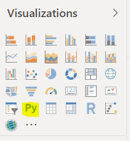
In Power BI Desktop, select the Python visualization:
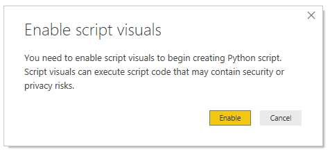
You may see the message below. Click Enable:
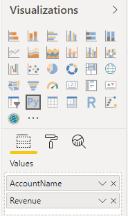
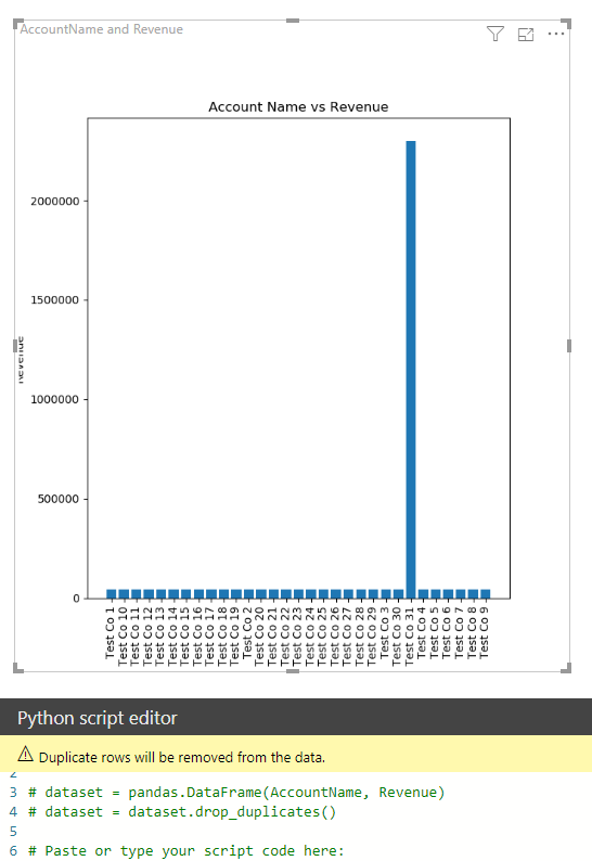
We will add a couple of fields from our dataset, AccountName and Revenue to Values:
We can see the following Python code is already added: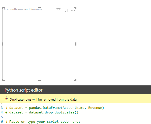
# dataset = pandas.DataFrame(AccountName, Revenue)
# dataset = dataset.drop_duplicates()
# Paste or type your script code here:
import matplotlib.pyplot as plt
plt.xlabel(‘Account Name’)
plt.xticks(rotation=’vertical’)
plt.ylabel(‘Revenue’)
plt.title(‘Account Name vs Revenue’)
plt.bar(dataset.AccountName, dataset.Revenue)
plt.show()
[/sourcecode]
This displays our chart in Power BI. Note we are using plt.xticks(rotation=’vertical’) to display the x-axis fields vertically, otherwise they will bunch together:

Explore AI, agents & Microsoft technology.
I share practical ideas, tutorials, and videos about AI, AI agents, Microsoft technologies, and the Power Platform.
Subscribe on YouTube →