In this post, we will go through how to create a Power BI chart that compares numbers each year vs each previous year. We will use sales data as an example.
First, let’s connect to our data from Power BI Desktop. We will use the sample data from here and connect as in the example. This data holds 3 years of Orders data.
Once connected, create a simple date table that holds dates between the year ranges.
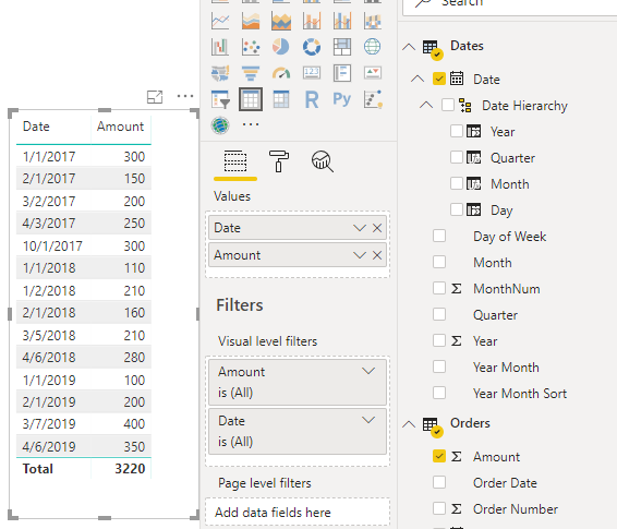
Now let’s build our report. First, a simple view of our data. We can see we have orders from 2017 to 2019:
Let’s create a measure called Total Sales. This displays the total of all sales based on the context:
Total Sales = SUM('Orders'[Amount])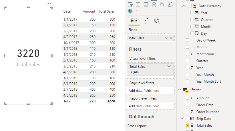
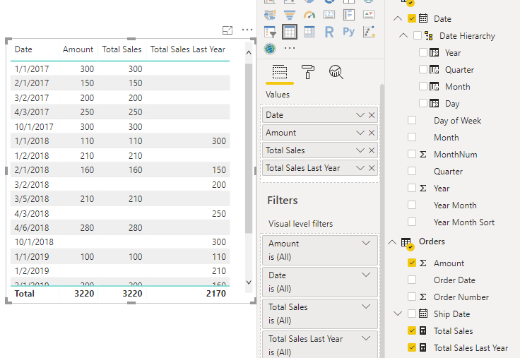
Now let’s use SAMEPERIODLASTYEAR to create a measure for the total sales this year:
Total Sales Last Year = CALCULATE([Total Sales], SAMEPERIODLASTYEAR(Dates[Date]))
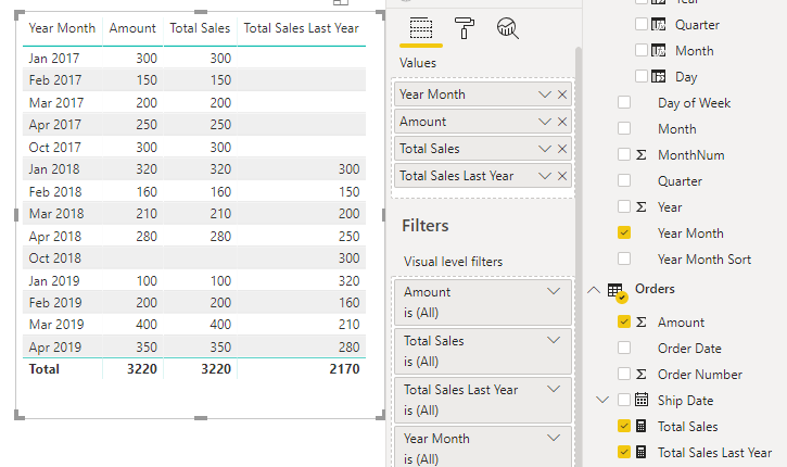
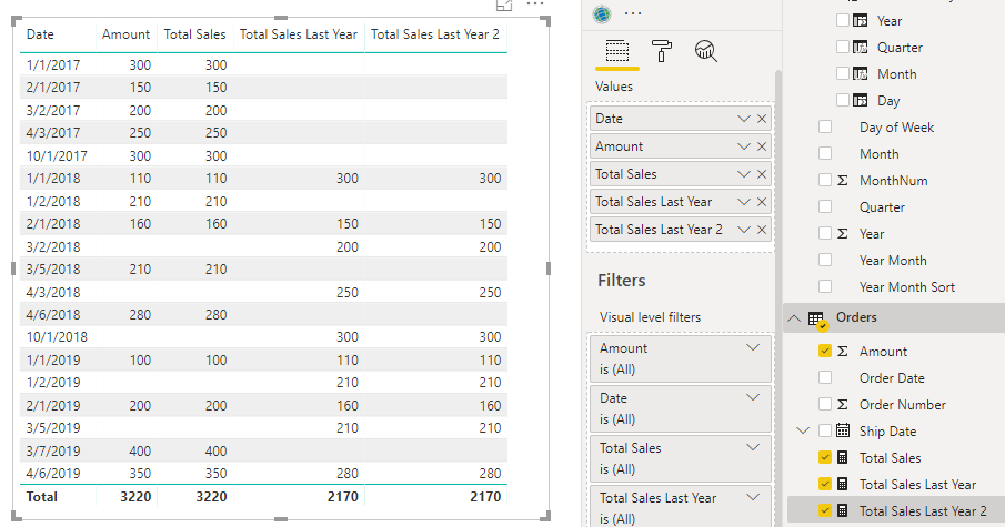
If we swapped the day for YEAR-MONTH, we can see we are now comparing the YEAR-MONTH periods. For example, in January 2018 there was a total of 320 in sales. In January 2019, the total was 100 and Total Sales Last Year is displaying the 320 correctly:
From here, we can create our column chart showing the comparisons of year vs previous year:
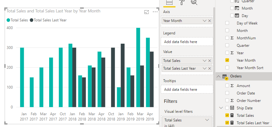
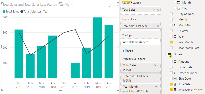
As 2017 did not have previous year data (i.e. maybe it was the first year of business), we may want to exclude it. Let’s remove it by filtering the visual, and change the chart to a Line and Clustered Column Chart, which can also easily allow us to compare periods:
Note using SAMEPERIODLASTYEAR is similar to using DATEADD, e.g.
Total Sales Last Year 2 = CALCULATE([Total Sales], DATEADD(Dates[Date], -1, YEAR))
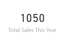
And if you want a measure to see the total sales this year, you can use:
Total Sales This Year = CALCULATE(SUM(Orders[Amount]), FILTER(Dates, Dates[Date].[Year] = YEAR(TODAY())))
I AM SPENDING MORE TIME THESE DAYS CREATING YOUTUBE VIDEOS TO HELP PEOPLE LEARN THE MICROSOFT POWER PLATFORM.
IF YOU WOULD LIKE TO SEE HOW I BUILD APPS, OR FIND SOMETHING USEFUL READING MY BLOG, I WOULD REALLY APPRECIATE YOU SUBSCRIBING TO MY YOUTUBE CHANNEL.
THANK YOU, AND LET'S KEEP LEARNING TOGETHER.
CARL

Hi Carl
Can you please clarify what ‘Year Month’ and ‘Year Month Sort’ fields are? Formulas, data structure etc.
This would be very helpful because it feels that this part of the guide was omitted.
Hi Aleksei,
Good question. It is part of the date table. This is how to create a very simple date table in Power BI – https://carldesouza.com/creating-a-really-simple-date-table-in-power-bi/. You can add columns for the Year Month and Year Month Sort with the formulas below, replacing YourDate with the date field in the date table. These fields are optional, but the reason we may want them, is say we have a report where we want to display data by “Sep 2019”, “Oct 2019”, “Nov 2019”, then the Year-Month column will display the date in this format. However, Power BI would try to display this alphabetically as “Nov 2019”, “Oct 2019”, “Sep 2019”. So, we add a Year Month Sort column that has values such as 201909, 201910, 201911 and in the Modeling tab, sort the Year Month column by the Year Month Sort column.
Formulas:
“Year Month”, FORMAT (YourDate, “mmm yyyy”),
“Year Month Sort”, YEAR(YourDate) & FORMAT(YourDate, “mm”),
Hi Carl,
I would like to put the 3 years date below in one row, I can only get for the last year but I cannot make for 2 years before (2019 vs 2017)
Jan 2019: 100
Jan 2018: 110
Jan 2017: 300
Can you please advice.
Very helpful explanation! Thank you!
Thank you for your explanation, this is help full for me
this was great – how would you dynamically rename the measures? as in – on your stacked bar chart you have ‘Total Sales’ and ‘Total Sales last Year’ – I would think it would be more clear to have that legend say the year number (2017 or 2018) in certain instances
Very helpful Carla! Exactly what I was looking for. And I find your explanations clear, concise and easy to follow (with the small caveat of the Year-Month field you addressed above). Thank you!!!