Interactive Experience dashboards in Dynamics 365 are a modern, real-time dashboard experience that allows users to view and act on data quickly and easily. In this post, we will look at the different types of interactive experience dashboards and how they are used.
In Dynamics 365, there are 2 types of Interactive Experience dashboards:
- Single-Stream Dashboards, which support single “streams”
- Multi-Stream Dashboards, which support multiple “streams”
A stream of data is a Dynamics 365 view or queue, such as My Activities, or a cases queue. Each data stream may come from a different source of data, such as Account, Cases, Contacts etc. The ability to show a single data stream or more than one data stream on a given dashboard is determined by the “single” or “multi” stream types: single stream supports only one stream, and multi-stream supports more than one stream. Both types of dashboards display data in real-time.
To highlight the differences between these dashboard types, there are two out of the box dashboards in Customer Service Hub – “Tier 1 Dashboard”, which is multi-stream dashboard, and “Tier 2 Dashboard”, which is a single stream dashboard. The scenario is that a Tier 1 support agent will need to monitor multiple streams of data, while Tier 2 agents will be looking at less but possibly more complex cases.
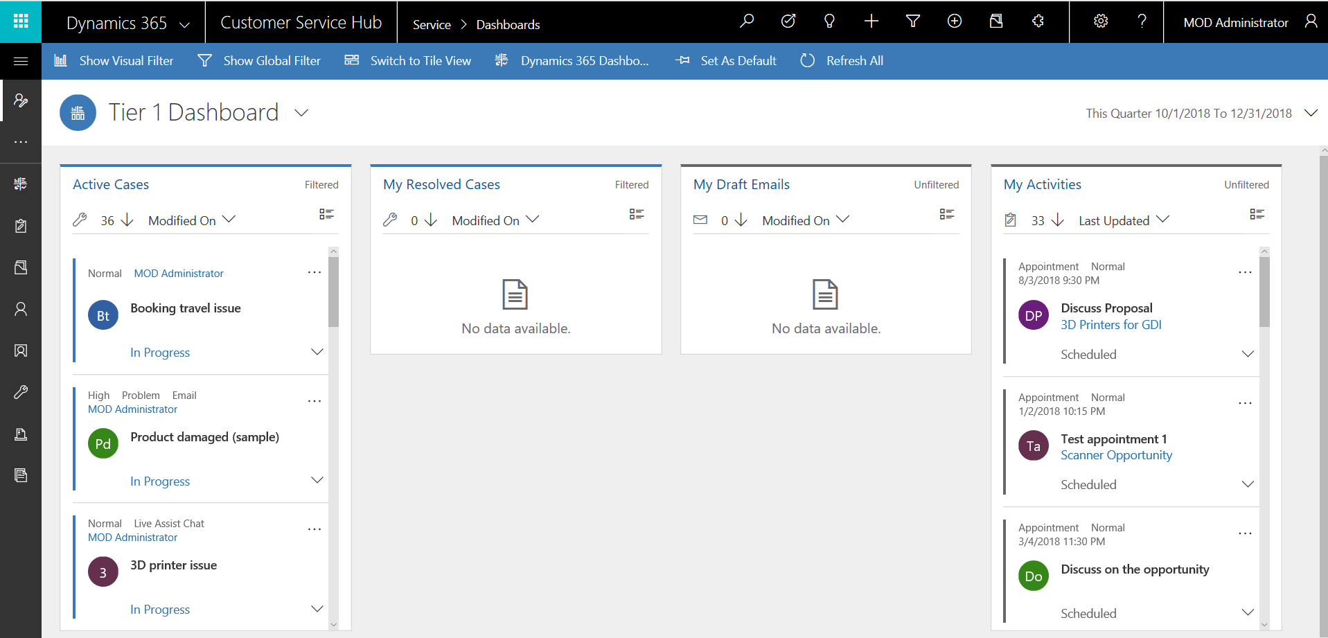
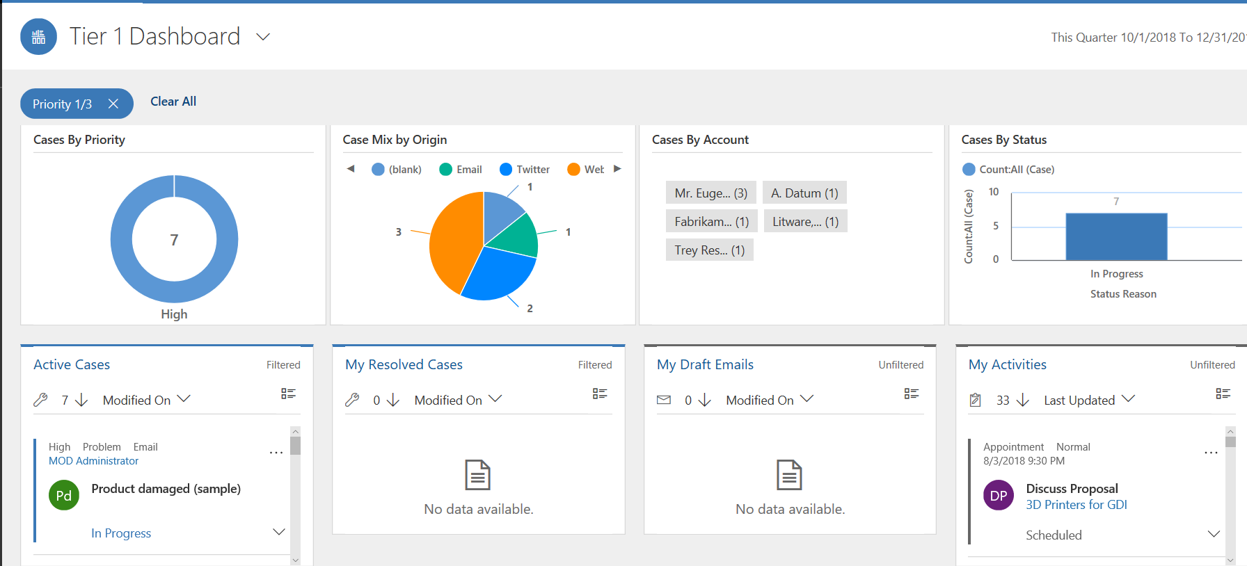
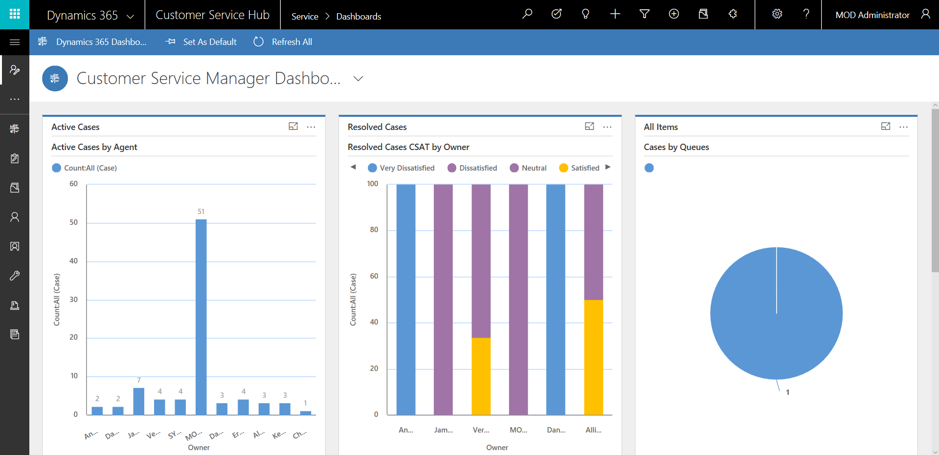
For example, this “Tier 1” dashboard sample shows multiple streams of information – Active Cases, My Resolved Cases, My Draft Emails and My Activities:
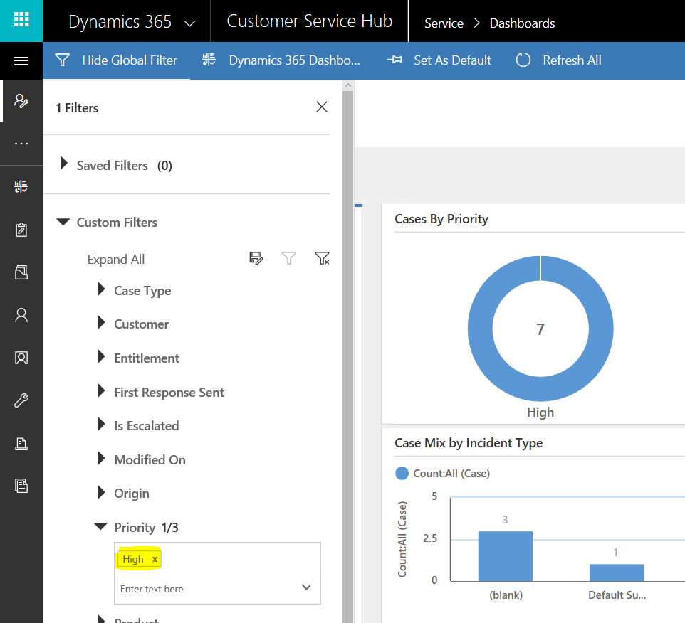
If we click on “Show Visual Filter”:
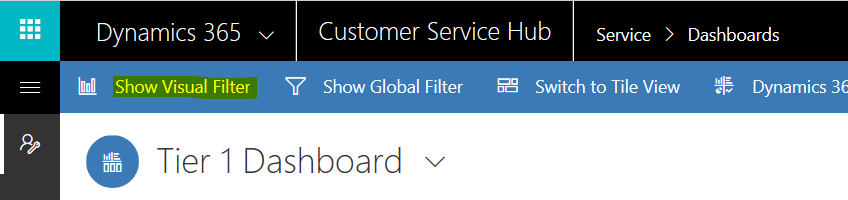
It displays filters in a top section:
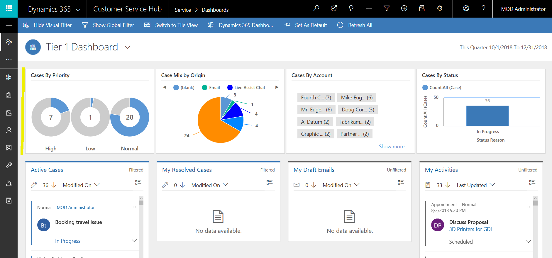
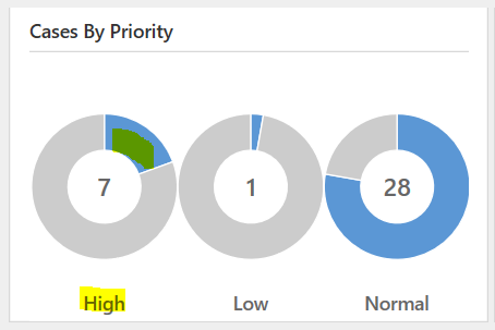
If we wanted to filter the data in the dashboard by high priority cases, we could select High in the visualization:
Which then redraws the dashboard with the filtered data:
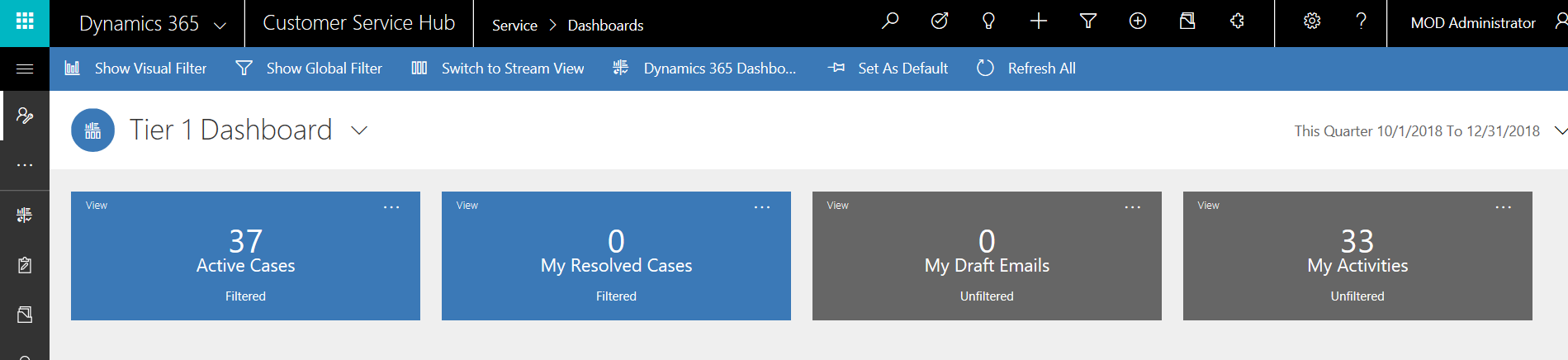
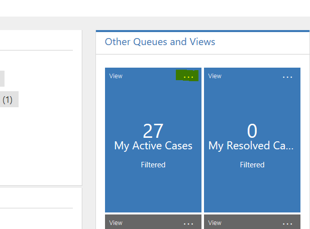
You can also switch to “tile view” to see the data as tiles:
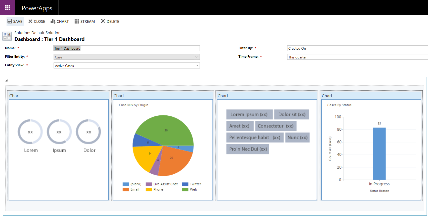
If we open this dashboard in Customizations, we can see the charts used for filtering at the top and the multiple streams at the bottom:
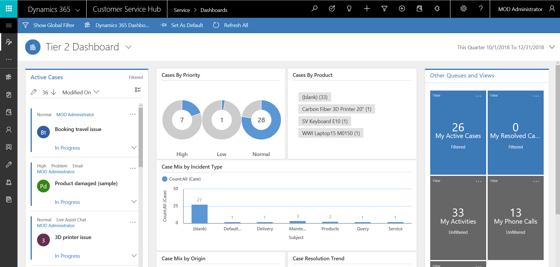
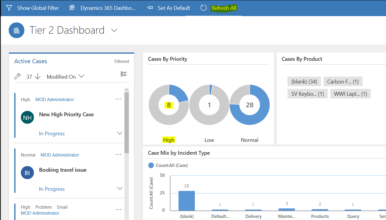
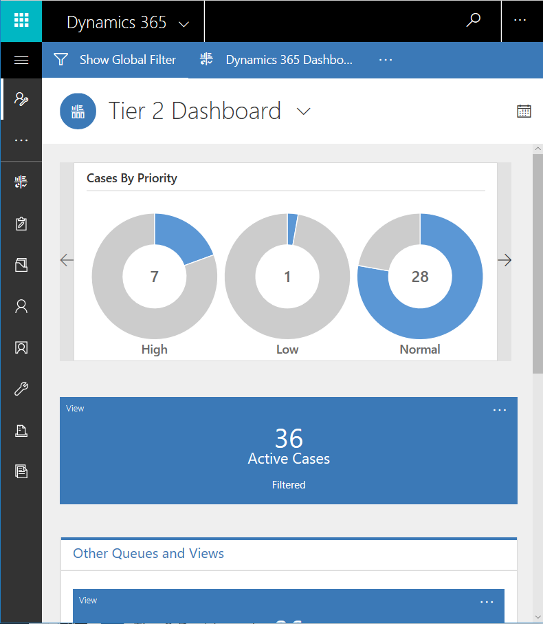
Let’s compare this with the “Tier 2” dashboard. We can see there is one single “stream”, the Active Cases:
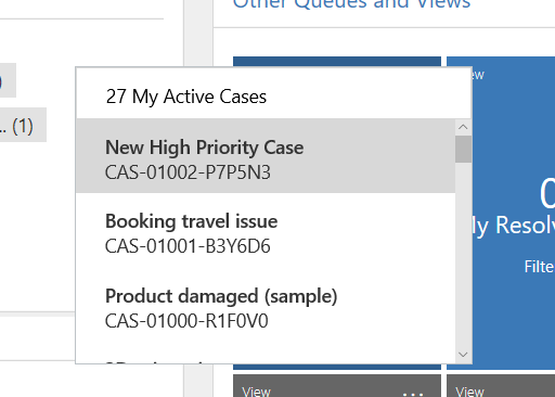
Selecting “…” on a tile on the right shows the underlying cases, which you can then select to open:
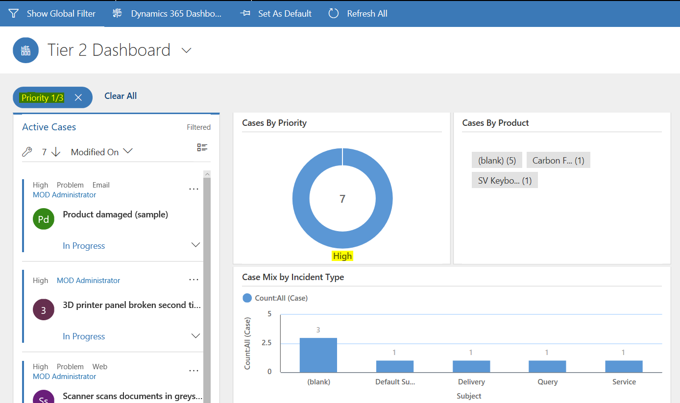
We can filter data in the same way as the Tier 1 multi stream dashboard, for example by selecting High Priority cases:
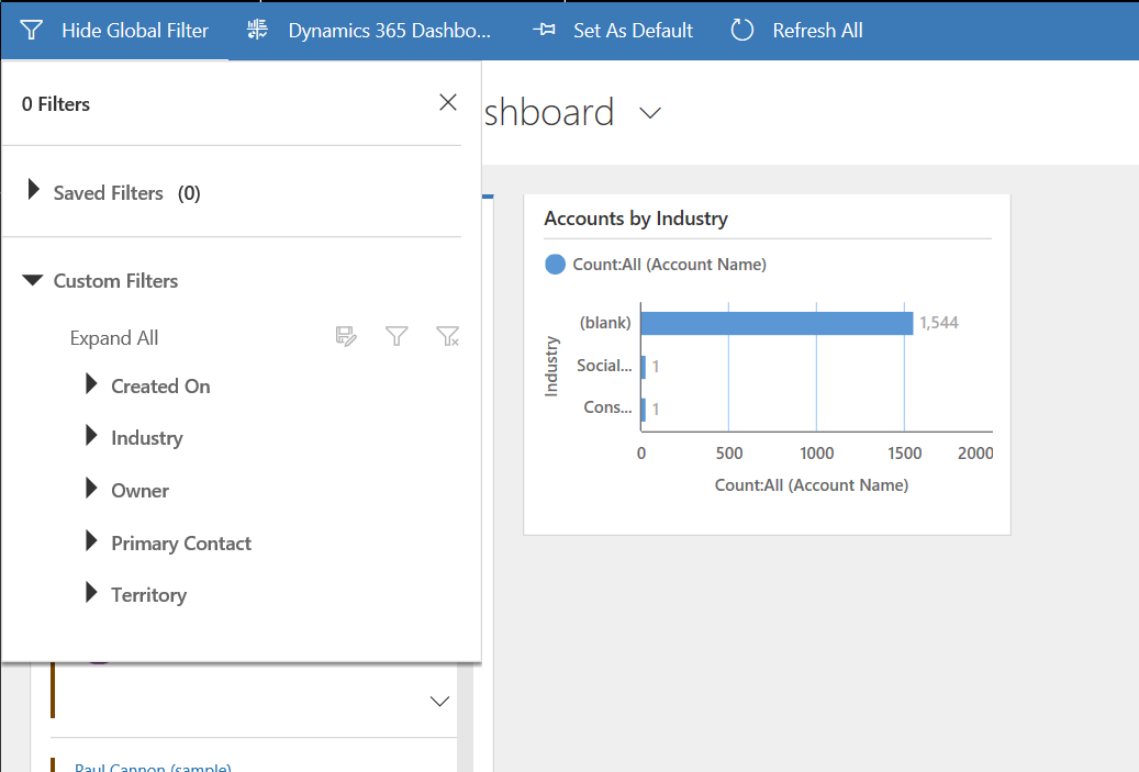
Selecting the Global Filter also allows us to filter:
Viewing this dashboard in the designer, we can see there is only one stream option, which is used by Active Cases. The option for multiple streams is not available:
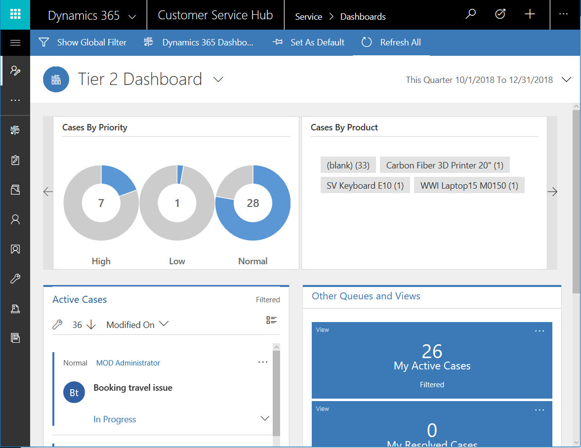
The dashboards are “real-time”. If we create a new case, and click “Refresh All”, it will show the refreshed data:
Note also interactive experience dashboards have a responsive design, matching the size of your web browser:
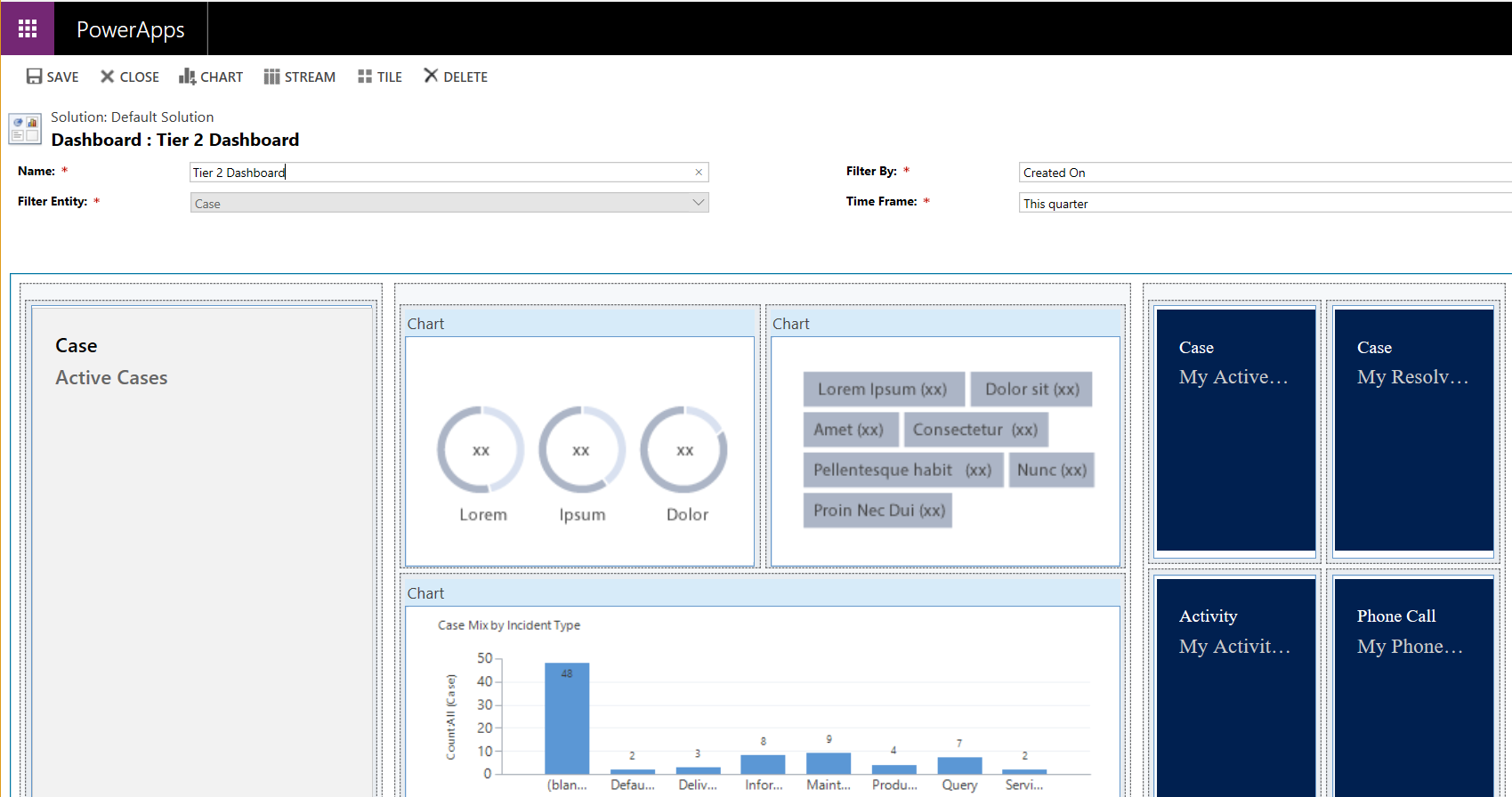
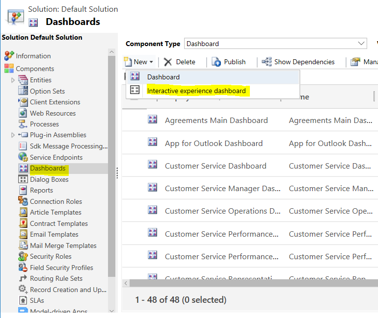
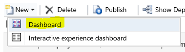
Let’s create a new interactive dashboard in the designer in Customizations. Select New->Interactive Experience Dashboard:
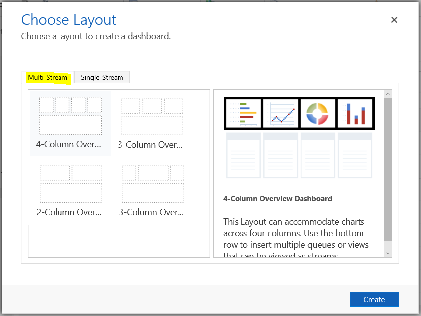
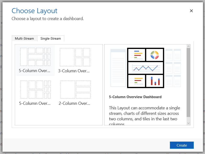
Next, we choose the layout.
Multi-Stream options include:
- 4-Column Overview Dashboard
- 3-Column Overview Dashboard
- 2-Column Overview Dashboard
- 3-Column Overview Dashboard – II
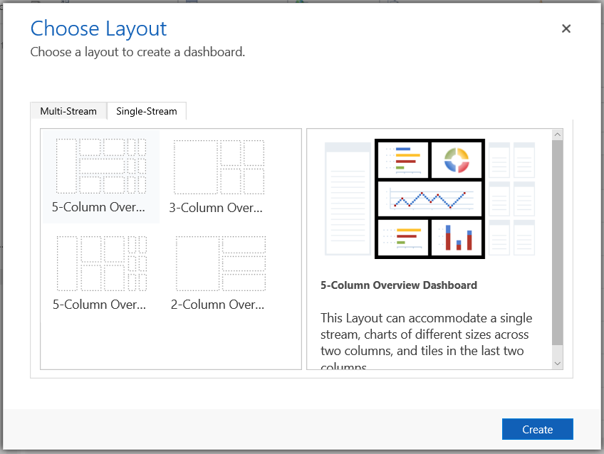
Single-Stream Dashboard options include:
- 5-Column Overview Dashboard
- 3-Column Overview Dashboard
- 5-Column Overview Dashboard – II
- 2-Column Overview Dashboard
Compare this to “Classic” dashboards:
Which have the options:
- 3-Column Regular Dashboard
- 3-Column Multi-Focused Dashboard
- 4-Column Overview Dashboard
- 2-Column Regular Dashboard
- 3-Column Overview Dashboard
- 3-Column Focused Dashboard
- 4-Column Regular Dashboard
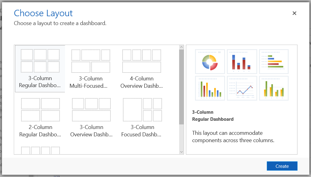
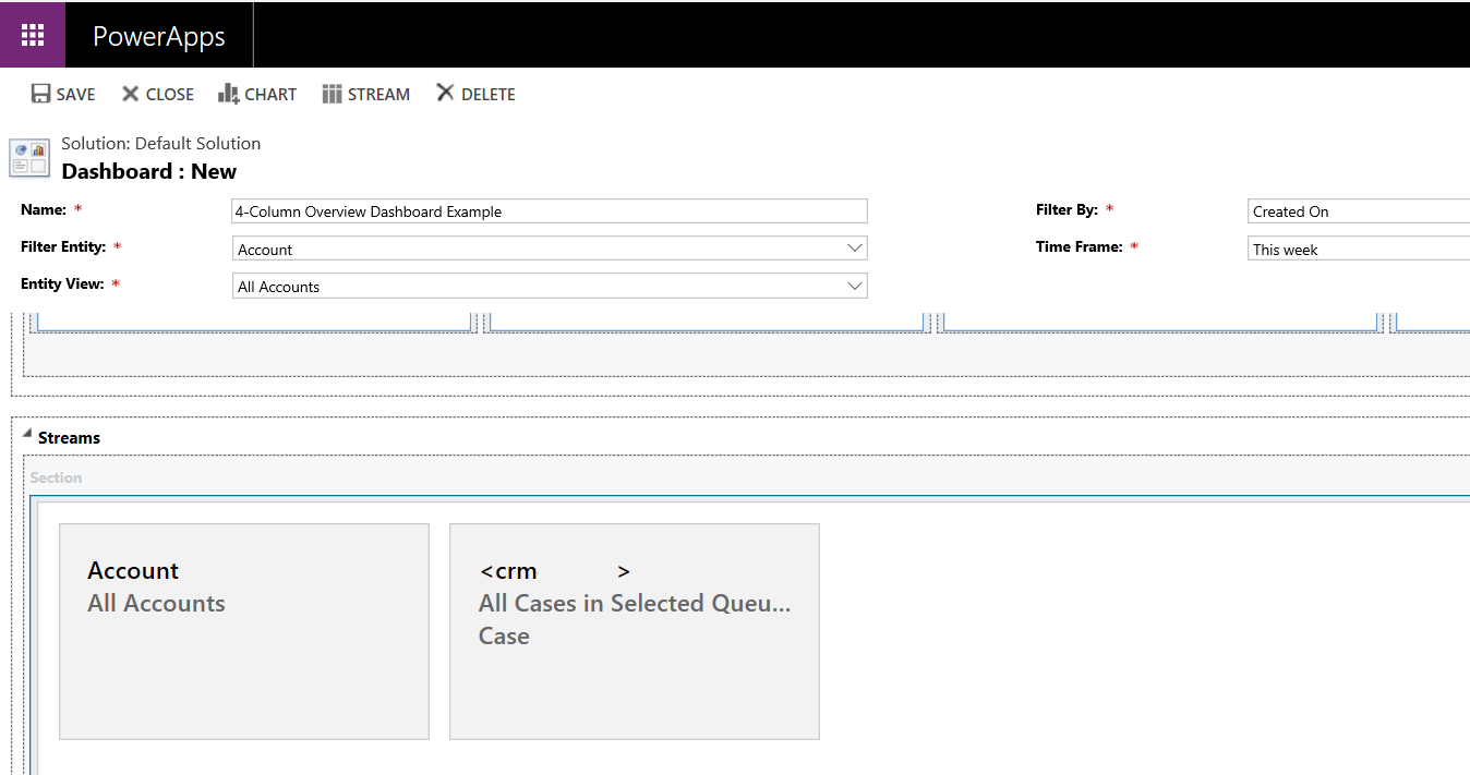
We will create a multi-stream 4-Column Overview Dashboard:
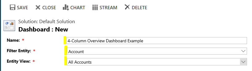
Provide a name:
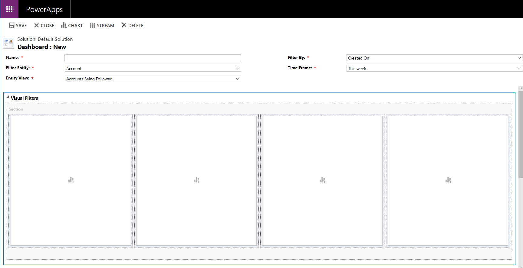
Let’s add some charts:
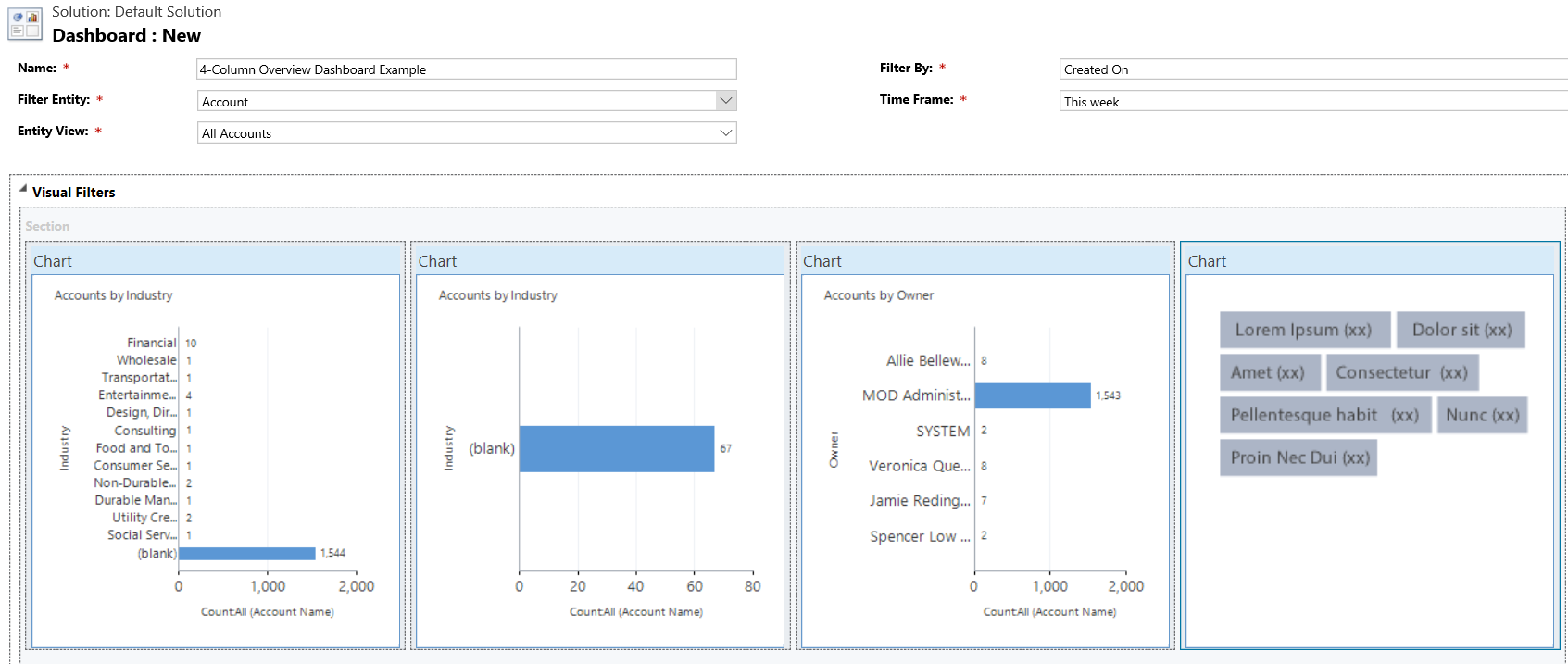
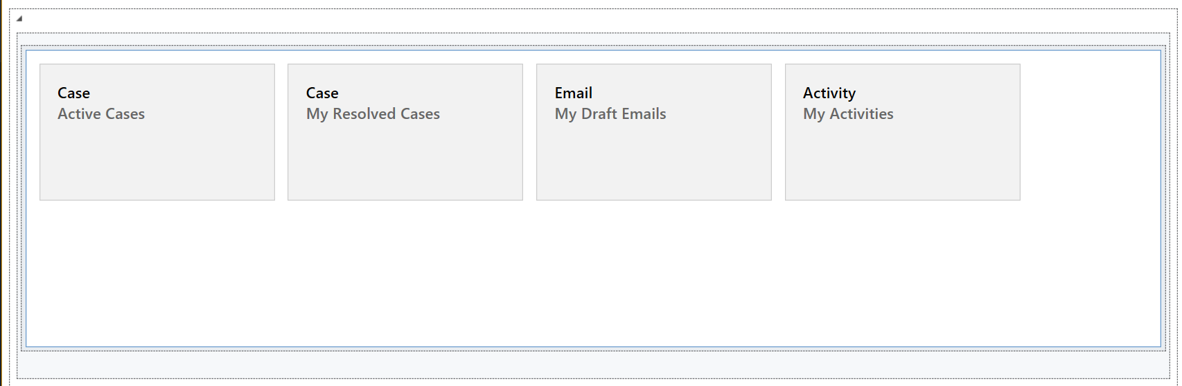
Scrolling down, we can see a Streams panel:
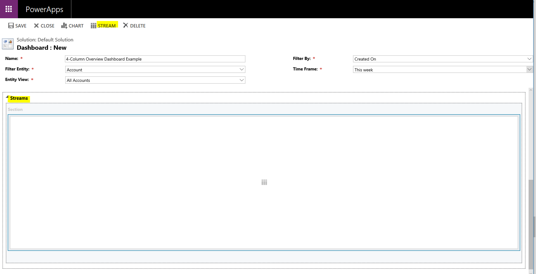
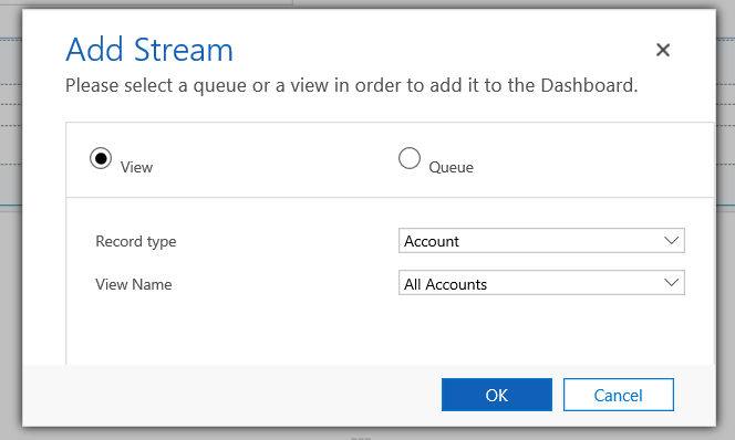
Note the options to add a View or Queue:
And streams:
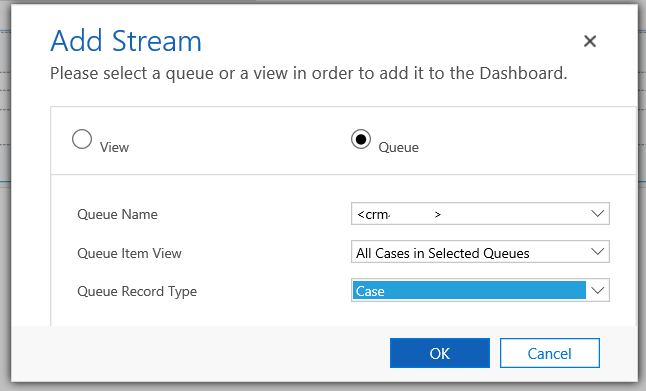
Add a couple of streams:
Save and Close the chart, then Publish All.
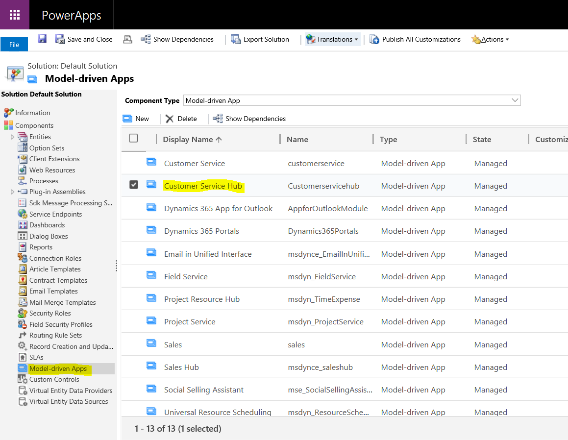
Now in Customizations, go to Model-Driven Apps and open the app where you would like the dashboard to appear, in this case Customer Service Hub:
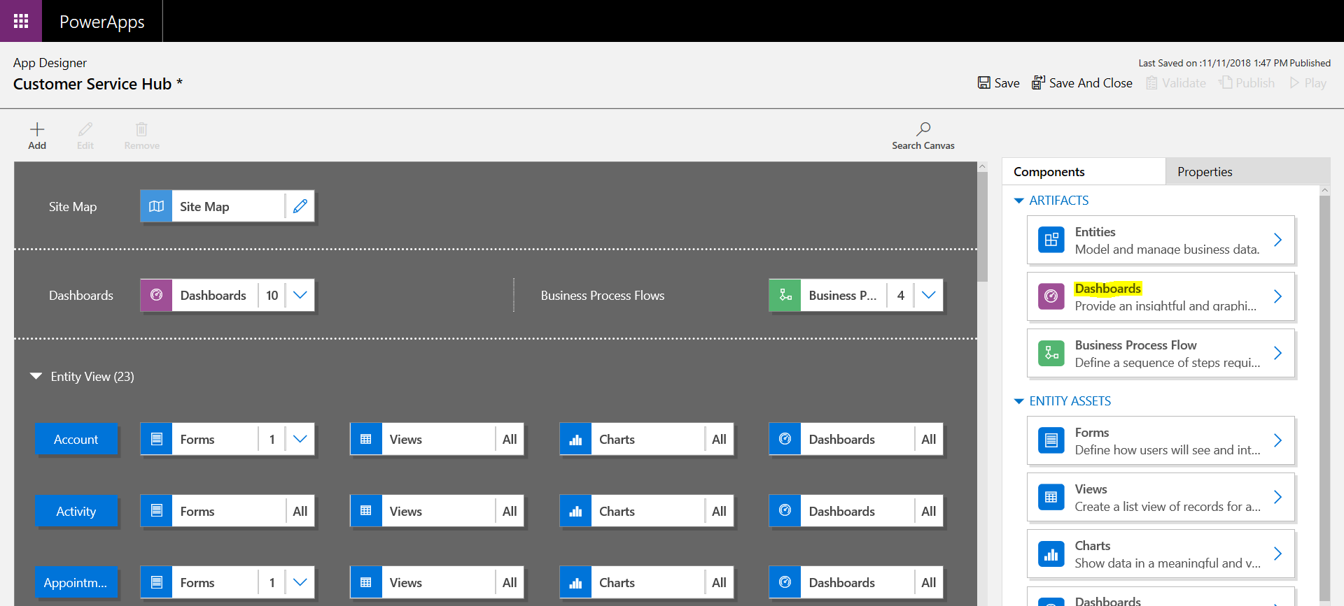
Select Dashboards:
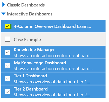
Under Interactive Dashboards, select the new dashboard:
Save, and then Publish the changes:
![]()
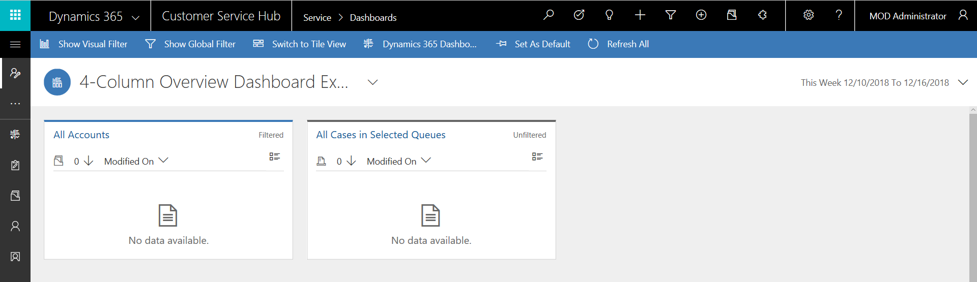
In Customer Service Hub, the new dashboard will now appear in the list:
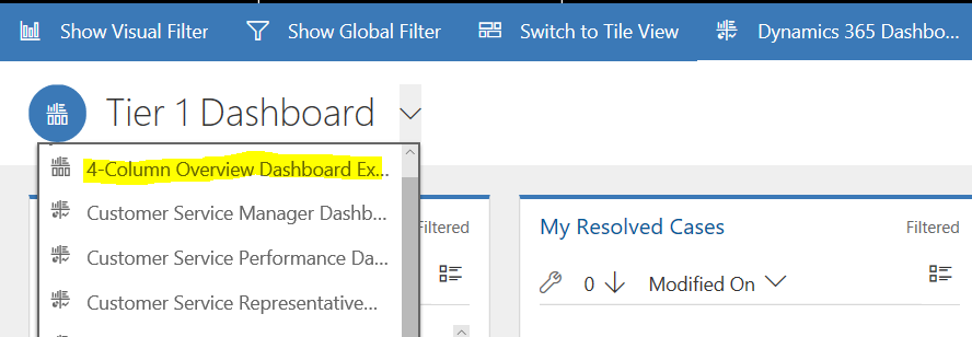
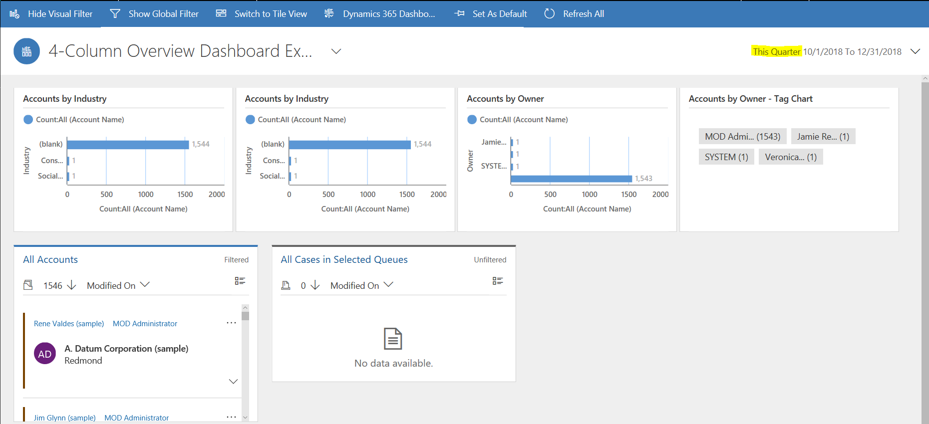
With the streams showing:
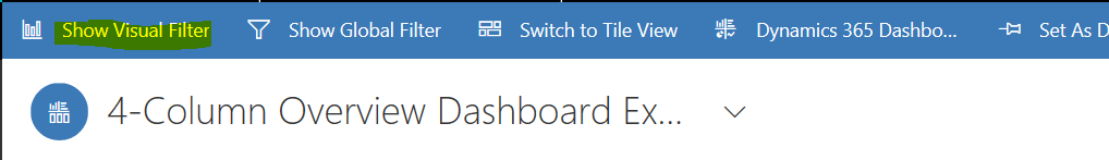
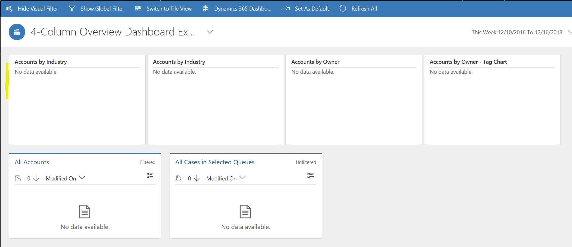
Click Show Visual Filter to display the visual filters:
Change the time period to display more data:
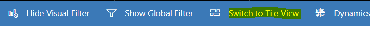
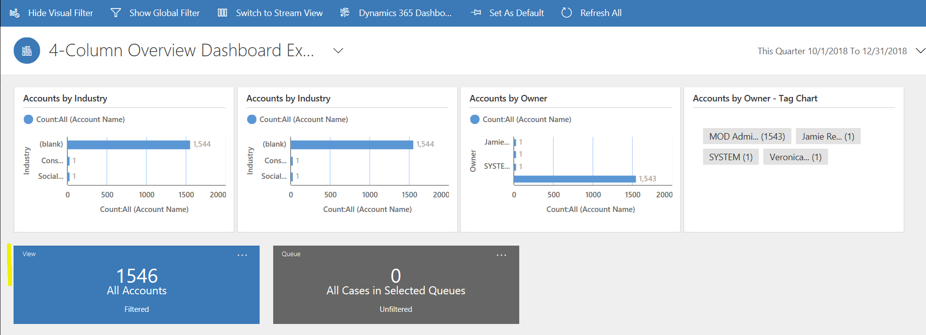
Select Tile View to view tiles:
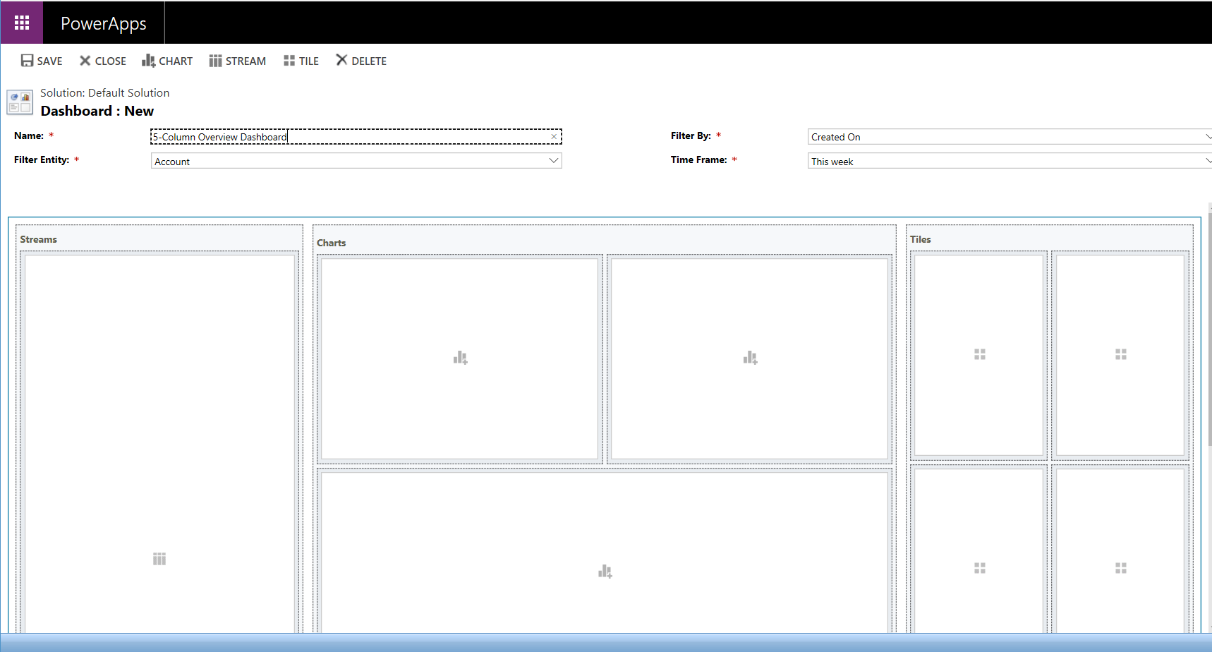
Let’s now create a Single Stream Dashboard, back in Customizations. We will choose a 5-Column Overview Dashboard:
This looks like:
We will add one stream, chart and tile to demonstrate:
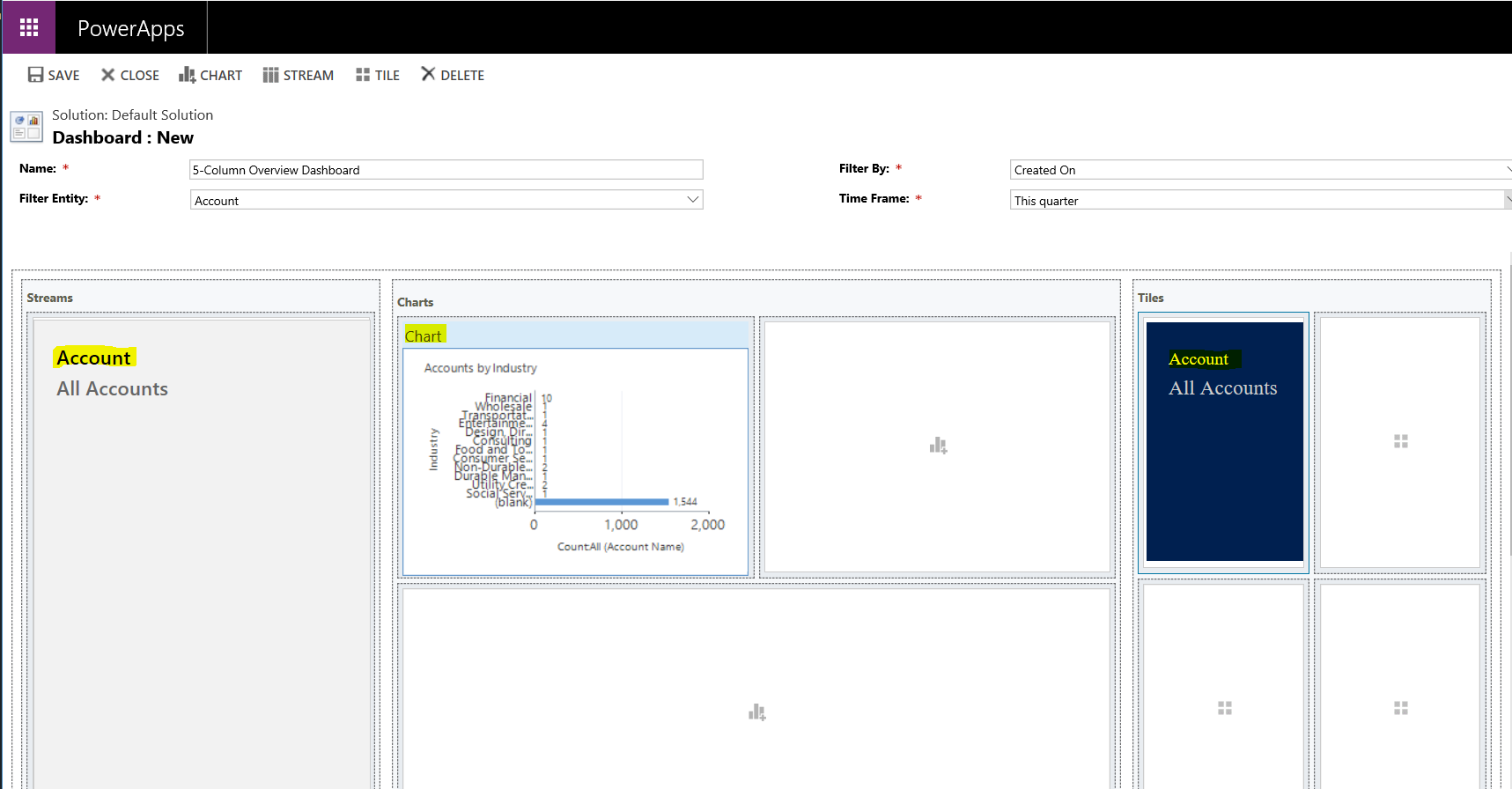
Save, Close and Publish All.
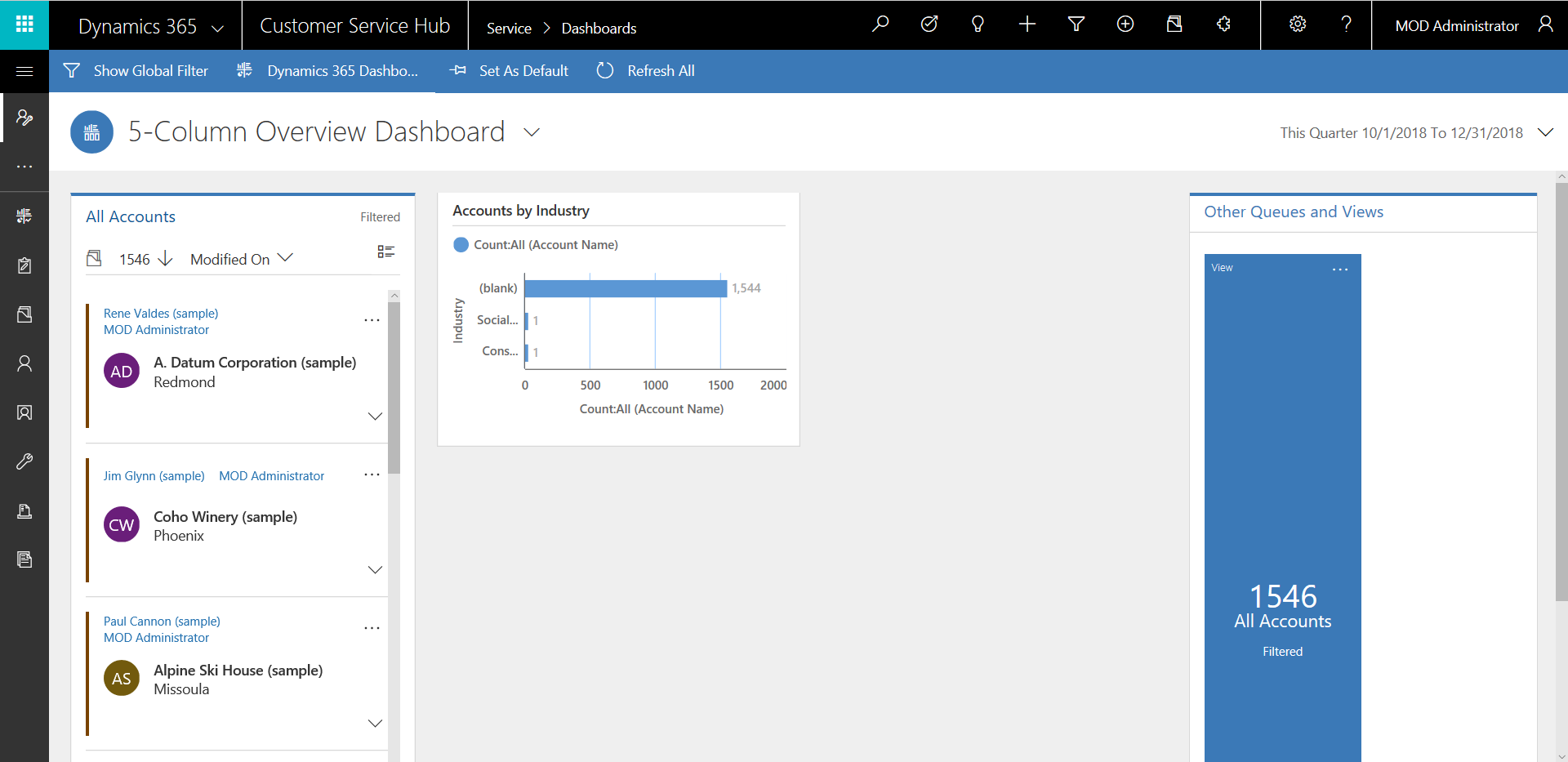
You will now be able to see the dashboard:
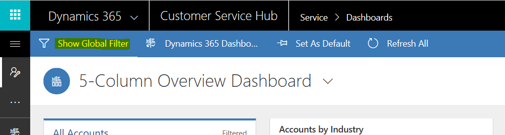
With option to show the global filter:
Interactive Experience dashboards can be useful for users, compared to “classic” dashboards that are more limited in functionality:
I AM SPENDING MORE TIME THESE DAYS CREATING YOUTUBE VIDEOS TO HELP PEOPLE LEARN THE MICROSOFT POWER PLATFORM.
IF YOU WOULD LIKE TO SEE HOW I BUILD APPS, OR FIND SOMETHING USEFUL READING MY BLOG, I WOULD REALLY APPRECIATE YOU SUBSCRIBING TO MY YOUTUBE CHANNEL.
THANK YOU, AND LET'S KEEP LEARNING TOGETHER.
CARL

I’m studying for my MB-230 exam and the topic of Multi-Stream vs Single-Stream Dashboards was confusing for me. It is all clear after reading your blog. Thanks.
Hi, I was wondering how you made your streams have extra fields.