Panel Layouts are a type of hosted control in USD that defines the arrangement of panels, which is the layout of your USD application.
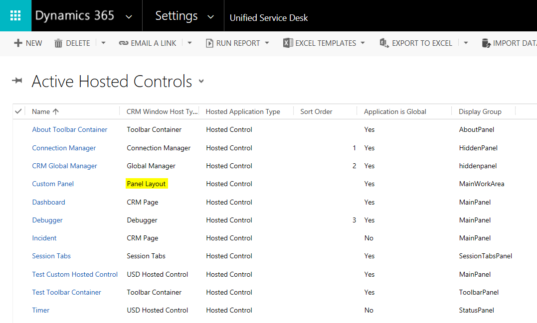
Selecting Unified Service Desk->Hosted Controls, you can see we have a Panel Layout hosted control defined:
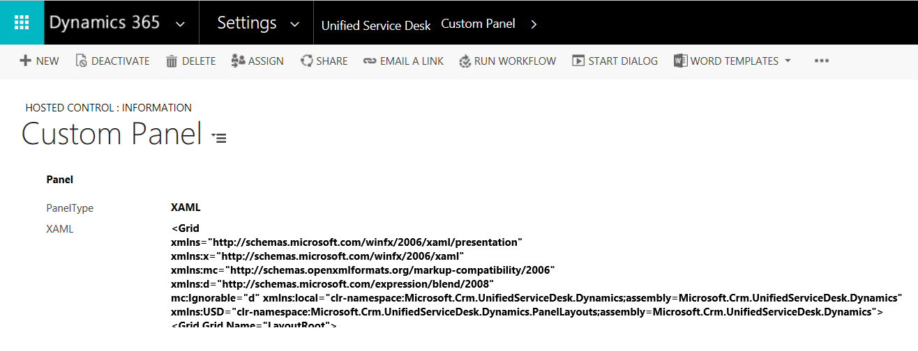
Selecting the panel, you can see the XAML associated with the layout:
Within the XAML, you can see panel types such as USDTabPanel, USDDeckTabPanel, USDStackPanel, USDCollapsePanel, USDPopupPanel, and panels, including:
- MainPanel
- LeftPanelFill
- RightPanel
- ToolbarPanel
- CtiPanel
- AboutPanel
- SessionTabsPanel
- SessionExplorerPanel
- WorkflowPanel
- ChatPanel
- LeftPanel1
- LeftPanel2
- RibbonPanel
- RightPopupPanel
- StatusPanel
You can read more about Panels on the Microsoft website: https://msdn.microsoft.com/en-us/library/dn865006.aspx
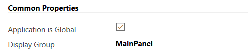
The main window is itself a panel called MainWorkArea.
In the hosted control definition, the panel to open the hosted control is specified.
Check out the XAML of a typical panel layout:
<Grid
 xmlns="http://schemas.microsoft.com/winfx/2006/xaml/presentation"
 xmlns:x="http://schemas.microsoft.com/winfx/2006/xaml"
 xmlns:mc="http://schemas.openxmlformats.org/markup-compatibility/2006"
 xmlns:d="http://schemas.microsoft.com/expression/blend/2008"
 mc:Ignorable="d" xmlns:local="clr-namespace:Microsoft.Crm.UnifiedServiceDesk.Dynamics;assembly=Microsoft.Crm.UnifiedServiceDesk.Dynamics"
 xmlns:USD="clr-namespace:Microsoft.Crm.UnifiedServiceDesk.Dynamics.PanelLayouts;assembly=Microsoft.Crm.UnifiedServiceDesk.Dynamics">
 <Grid Grid.Name="LayoutRoot">
 <Grid.Resources>
 <local:CRMImageConverter x:Key="CRMImageLoader" />
</Grid.Resources>
 <Grid.RowDefinitions>
 <RowDefinition Height="40" />
 <RowDefinition Height="*" />
 <RowDefinition Height="30" />
 </Grid.RowDefinitions>
 <Border Grid.Row="0" BorderBrush="#FFD8D8D8" BorderThickness="0,1,0,1">
 <Grid Background="{DynamicResource WindowHeaderStyle}" Grid.Row="0" Margin="0">
 <Grid.ColumnDefinitions>
 <ColumnDefinition Width="auto" />
 <ColumnDefinition Width="auto" />
 <ColumnDefinition Width="*" />
 <ColumnDefinition Width="Auto" />
 </Grid.ColumnDefinitions>
 <Image Style="{DynamicResource USDLogo}" Grid.Column="0" ToolTip="Unified Service Desk" AutomationProperties.Name="Unified Service Desk" />
 <Rectangle FrameworkElement.Width="10" Grid.Column="1" />
 <USD:USDDeckTabPanel x:Name="ToolbarPanel" Grid.Column="2" AutomationProperties.Name="Toolbar Panel" VerticalAlignment="Center" Focusable="True" Margin="0" />
 <Grid Grid.Column="3" Background="{DynamicResource AboutPanelBackground}">
 <Grid.ColumnDefinitions>
 <ColumnDefinition Width="*" />
 <ColumnDefinition Width="412" />
 </Grid.ColumnDefinitions>
 <USD:USDStackPanel x:Name="CtiPanel" Grid.Column="0" Orientation="Horizontal" Focusable="True" VerticalAlignment="Center" AutomationProperties.Name="Cti Panel" />
 <USD:USDStackPanel x:Name="AboutPanel" Grid.Column="1" HorizontalAlignment="Right" Orientation="Horizontal" Focusable="True" VerticalAlignment="Center" AutomationProperties.Name="AboutPanel" />
 </Grid>
 </Grid>
 </Border>
 <Grid Grid.Row="1" VerticalAlignment="Stretch" Margin="0" Background="{DynamicResource WindowBackgroundStyle}">
 <Grid.RowDefinitions>
 <RowDefinition Height="auto" />
 <RowDefinition Height="*" />
 <RowDefinition Height="auto" />
 </Grid.RowDefinitions>
 <USD:USDDeckTabPanel x:Name="SessionTabsPanel" Grid.Row="0" Margin="5,5,0,5" AutomationProperties.Name="Session Tabs Panel" Focusable="True" ClipToBounds="True" Background="Red" />
 <Grid Grid.Row="1" AutomationProperties.Name="Main Panels">
 <Grid.ColumnDefinitions>
 <ColumnDefinition Width="auto" />
 <ColumnDefinition Width="*" />
 <ColumnDefinition Width="auto" />
 </Grid.ColumnDefinitions>
 <Expander x:Name="ExpanderSessionDetails" Grid.Column="0" Style="{DynamicResource StretchExpanderStyle}" ExpandDirection="Left" IsExpanded="False" BorderBrush="#FFFFFFFF">
 <ScrollViewer VerticalScrollBarVisibility="Auto">
 <Grid Style="{DynamicResource LeftPanelGrid}" Margin="5">
 <Grid.RowDefinitions>
 <RowDefinition Height="auto" />
 <RowDefinition Height="auto" />
 <RowDefinition x:Name="ChatPanelRow" Height="auto" />
 <RowDefinition Height="auto" />
 <RowDefinition Height="auto" />
 <RowDefinition Height="auto" />
 </Grid.RowDefinitions>
 <USD:USDCollapsePanel x:Name="SessionExplorerPanel" AutomationProperties.Name="Session Explorer Panel" Grid.Row="0" Margin="1" />
 <USD:USDCollapsePanel x:Name="WorkflowPanel" AutomationProperties.Name="Workflow Panel" Grid.Row="1" Margin="1" Background="Aqua" />
 <USD:USDCollapsePanel x:Name="ChatPanel" AutomationProperties.Name="Workflow Panel" Grid.Row="2" Margin="1" />
 <USD:USDCollapsePanel x:Name="LeftPanel1" AutomationProperties.Name="Left Panel 1" Grid.Row="3" Margin="1" />
 <USD:USDCollapsePanel x:Name="LeftPanel2" AutomationProperties.Name="Left Panel 2" Grid.Row="4" Margin="1" />
 <USD:USDTabPanel x:Name="LeftPanelFill" AutomationProperties.Name="Left Panel Fill" Grid.Row="5" Margin="1" MinHeight="300" />
 </Grid>
 </ScrollViewer>
 </Expander>
 <Grid Grid.Column="1" Background="Transparent">
 <Grid.RowDefinitions>
 <RowDefinition Height="0" />
 <RowDefinition Height="*" />
 </Grid.RowDefinitions>
 <USD:USDCollapsePanel x:Name="RibbonPanel" Grid.Row="0" Visibility="Collapsed" AutomationProperties.Name="Ribbon Panel" Focusable="True" Margin="1" ClipToBounds="False" SnapsToDevicePixels="True" />
 <USD:USDTabPanel x:Name="MainPanel" Grid.Row="1" AutomationProperties.Name="Main Panel" Grid.RowSpan="2" />
 </Grid>
<GridSplitter HorizontalAlignment="Right"
 VerticalAlignment="Stretch"
 Grid.Column="1" ResizeBehavior="PreviousAndNext"
 Width="5" Background="#FFBCBCBC"/>
 <Expander x:Name="RightPanelExpander" Grid.Column="2" Style="{DynamicResource StretchExpanderStyle}" ExpandDirection="Right" IsExpanded="False" BorderBrush="#FFFFFFFF">
 <ScrollViewer VerticalScrollBarVisibility="Auto">
 <Grid Style="{DynamicResource LeftPanelGrid}">
 <Grid.RowDefinitions>
 <RowDefinition Height="*" />
 </Grid.RowDefinitions>
 <USD:USDTabPanel x:Name="RightPanel" AutomationProperties.Name="Right Panel" Grid.Row="0" />
 <USD:USDPopupPanel x:Name="RightPopupPanel" Popup.Placement="Left" Popup.PopupAnimation="Scroll" Height="{Binding ActualHeight,ElementName=RightPanel,Mode=OneWay}" Width="{Binding ActualWidth,ElementName=RightPanel,Mode=OneWay}" Popup.PlacementTarget="{Binding ElementName=RightPanel}" >
 <Grid>
 <Grid.RowDefinitions>
 <RowDefinition Height="20" />
 <RowDefinition Height="*" />
 </Grid.RowDefinitions>
 <Border Background="#FFCCCCCC" Grid.Row="0">
 <TextBlock Text="Article Preview" HorizontalAlignment="Center" Margin="10,0,0,0" />
 </Border>
 <Border BorderThickness="1" Grid.Row="1" BorderBrush="#FFCCCCCC" Background="#FFFFFFFF">
 <ContentControl x:Name="PopupContainer" Margin="0,0,0,0" />
 </Border>
 </Grid>
 </USD:USDPopupPanel>
 </Grid>
 </ScrollViewer>
 </Expander>
 </Grid>
 </Grid>
 <StatusBar Grid.Row="2" Style="{DynamicResource StatusBarStyle}">
 <StatusBarItem>
 <USD:USDStackPanel x:Name="StatusPanel" Height="30" Orientation="Horizontal" AutomationProperties.Name="Status Panel" />
 </StatusBarItem>
 </StatusBar>
 </Grid>
</Grid>
Note the different panel types:

- Standard Main Panel. This does not define the display group.
- Ribbon Main Panel. This does not define the display group.
- Vertical Split. Includes Display Group:
- Horizontal Split. Includes Display Group:

- XAML. Includes Display Group and XAML.

- User Defined. Includes Display Group:
I AM SPENDING MORE TIME THESE DAYS CREATING YOUTUBE VIDEOS TO HELP PEOPLE LEARN THE MICROSOFT POWER PLATFORM.
IF YOU WOULD LIKE TO SEE HOW I BUILD APPS, OR FIND SOMETHING USEFUL READING MY BLOG, I WOULD REALLY APPRECIATE YOU SUBSCRIBING TO MY YOUTUBE CHANNEL.
THANK YOU, AND LET'S KEEP LEARNING TOGETHER.
CARL

How can i create a custom panel layout same as Unified Interface??