When building model-driven Power Apps, one useful feature in the Power Apps form designer is the ability to view the form being designed in various different resolutions.
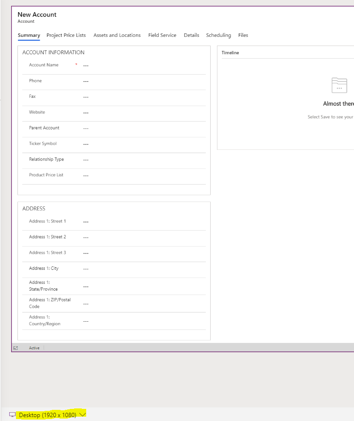
To use this, open a form in design mode. Below we are viewing the Account Main form. You can see at the bottom of the designer, we are displaying Desktop (1920 x 1080):
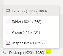
Clicking on this, we see there are other options:
- Desktop (1920 x 1080)
- Tablet (1024 x 768)
- Phone (411 x 731)
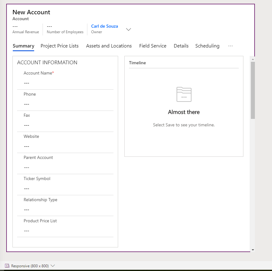
- Responsive (800 x 800)
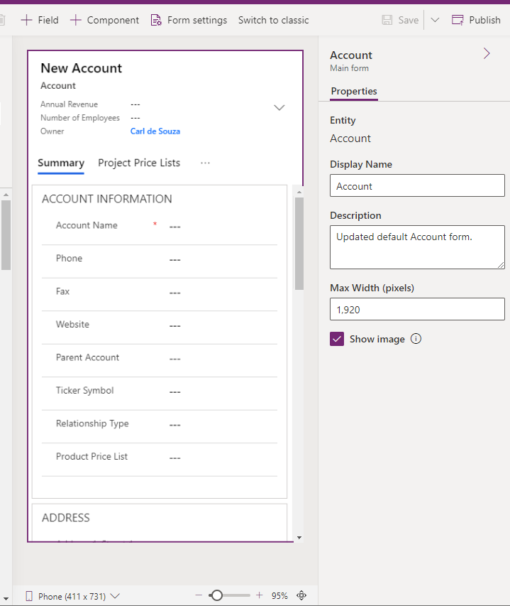
If we set it to Phone, we see the design layout redrawn to a phone view:
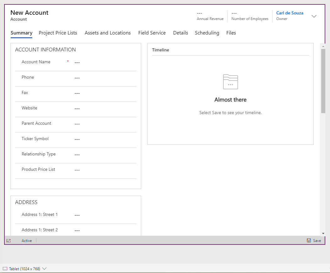
Same with Tablet:
And Responsive:
Useful when you’re building out forms targeting various consuming hardware.
I AM SPENDING MORE TIME THESE DAYS CREATING YOUTUBE VIDEOS TO HELP PEOPLE LEARN THE MICROSOFT POWER PLATFORM.
IF YOU WOULD LIKE TO SEE HOW I BUILD APPS, OR FIND SOMETHING USEFUL READING MY BLOG, I WOULD REALLY APPRECIATE YOU SUBSCRIBING TO MY YOUTUBE CHANNEL.
THANK YOU, AND LET'S KEEP LEARNING TOGETHER.
CARL
