In Dynamics 365, you can modify the layout of existing form sections. For example, let’s say you want to change the Summary tab of the Account to show 2 sections instead of 3, and remove the middle Social Pane section:

To do this, edit the form and delete the Social Pane field:

Move the controls from the right section to the middle section. Anything in the right column will be deleted when we move to 2 columns:
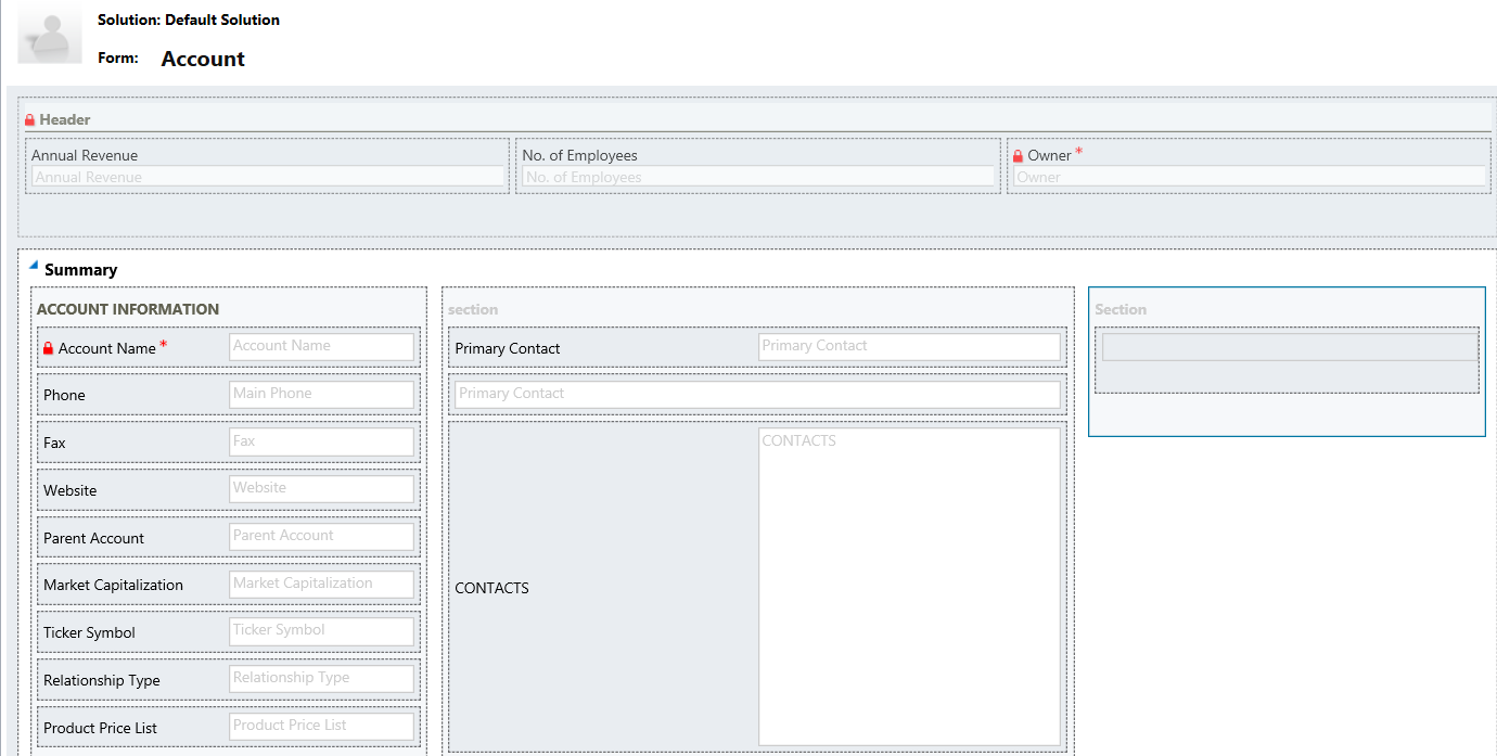
Now open the properties of the Summary tab. You will see there are 3 columns selected:
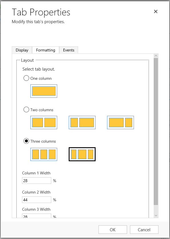
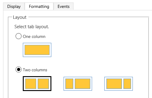
Change this to 2 columns:
You will now see 2 columns:
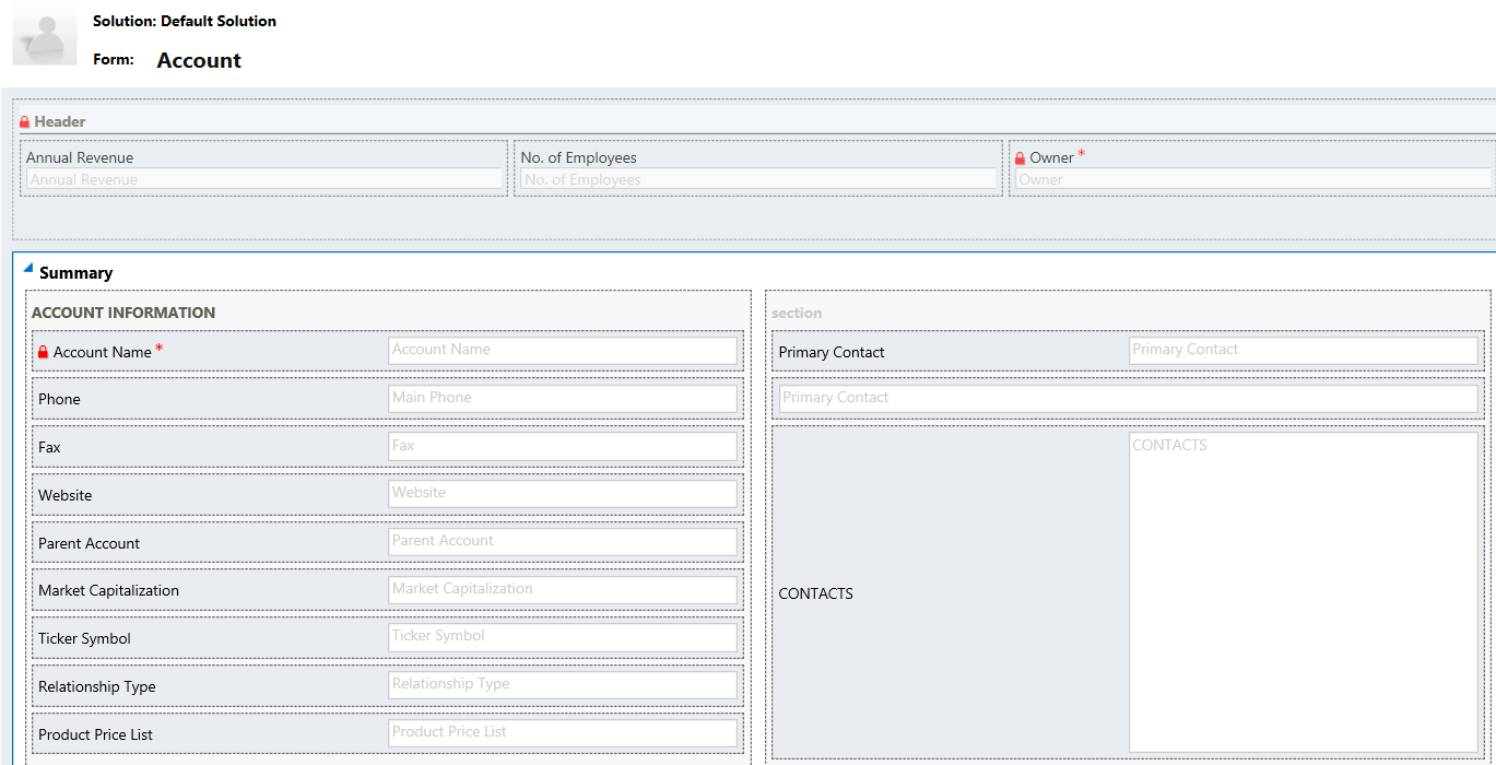
Save and Publish:
I AM SPENDING MORE TIME THESE DAYS CREATING YOUTUBE VIDEOS TO HELP PEOPLE LEARN THE MICROSOFT POWER PLATFORM.
IF YOU WOULD LIKE TO SEE HOW I BUILD APPS, OR FIND SOMETHING USEFUL READING MY BLOG, I WOULD REALLY APPRECIATE YOU SUBSCRIBING TO MY YOUTUBE CHANNEL.
THANK YOU, AND LET'S KEEP LEARNING TOGETHER.
CARL


Hi Carl,
I know this blog post was years back, but I thought it relevant to post this question here.
We have multiple teams working on configuration/development at our company. One problem we face is around form configuration when there are multiple teams working on the same form. Sometimes one team’s migration for a form on an entity will overwrite changes from another team form migration. I was wondering if it’s possible to move just the specific changes on a form and not the whole form? Ie, we add a section, and only that section is updated on the form?
Thank you for your consideration,
John
Hi Carl,
Thanks so much for this article. I have a 4 column section with 3 rows on a form – the 1st and 3rd columns contains web resource HTML buttons which open up Quick Create forms for related entities using JS. Next to the 1st and 3rd columns respectively, so columns 2 an 4, are Rollup fields which calculate the totals of the various related entities which were created via the HTML buttons in columns 1 and 3.
All looks good when i’m building on my screen, however, when i view it on a screen with lower resolution – it doesn’t display correctly anymore – basically everything goes in to 1 column – first 3 rows will be the first three HTML buttons and then underneath that will be the 3 rollup fields, then the next 3 buttons and then their corresponding rollup fields.
Is there any way of making sure that this section in particular doesn’t change size or re-arrange the columns so everything stays as it should?