I recently came across an issue with using dates in Power BI with column charts. Here we will go through the issue and how I resolved it. Perhaps someone out there will have more insight!
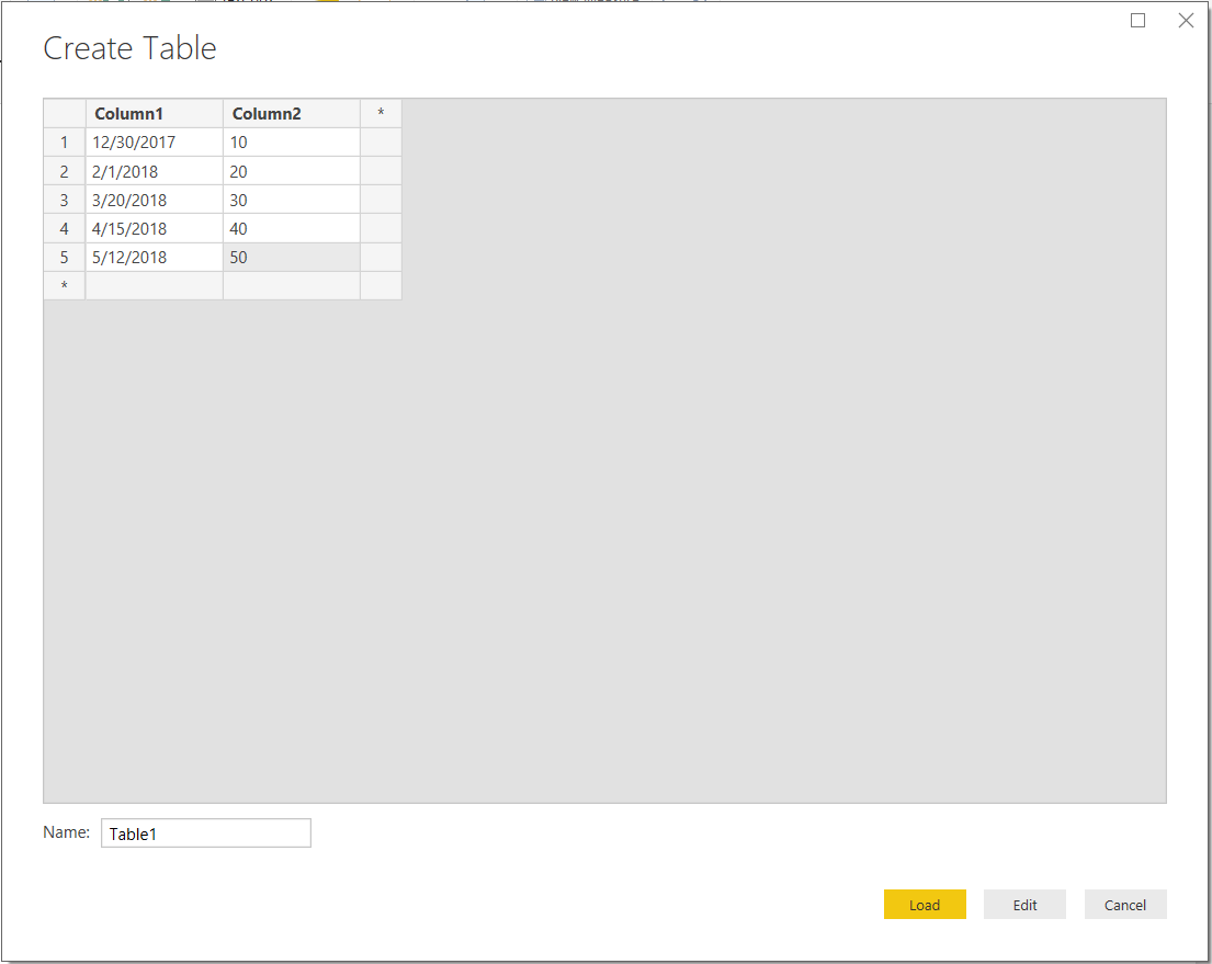
The first thing I did, was create a new Power BI Desktop project. To minimize the room for error, instead of pulling data from an external data source (the problem actually started this way), I choose to enter data manually:

My table looks like below. As you can see, I have 2 columns, with records in December, February, March, April and May:
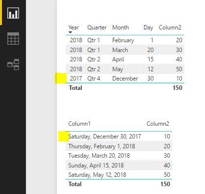
I then create 2 table visualizations on the canvas. You can see the records for December below. The first table uses the date hierarchy format and the second does not:
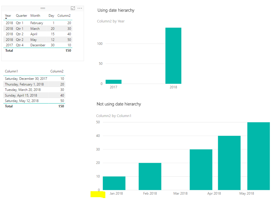
Next, I add 2 column chart visuals. The first one does not use the date hierarchy and the second does. Here’s where things get interesting. The December 2017 record has disappeared from the 2nd chart:
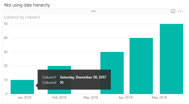
Zooming over this chart, Power BI shows the underlying data as December 30th 2017, though the column label shows as January 2018. It also appears everything has shifted to the right:
The main issue is that I want the user to be able to see the data by Month Year, e.g. Dec 2017.
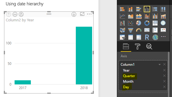
In order to resolve this, I use the date hierarchy visual. First remove the quarter and day as we don’t need these:
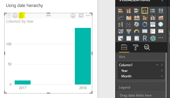
Next, click the button to expand all one level down:
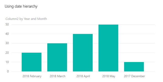
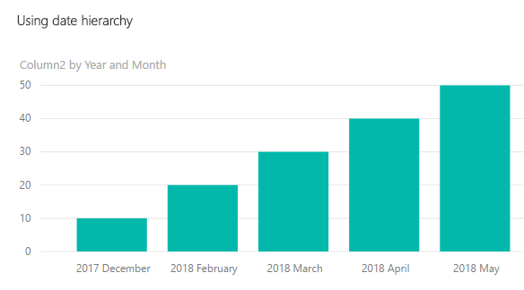
The December 2017 and other data is now showing correctly:
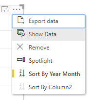
Next steps are to ensure the dates are sorted correctly. Select Sort By->Year Month:
The data is now displayed correctly:
I AM SPENDING MORE TIME THESE DAYS CREATING YOUTUBE VIDEOS TO HELP PEOPLE LEARN THE MICROSOFT POWER PLATFORM.
IF YOU WOULD LIKE TO SEE HOW I BUILD APPS, OR FIND SOMETHING USEFUL READING MY BLOG, I WOULD REALLY APPRECIATE YOU SUBSCRIBING TO MY YOUTUBE CHANNEL.
THANK YOU, AND LET'S KEEP LEARNING TOGETHER.
CARL
