In the previous posts, we installed R for Windows and RStudio as an IDE for R. Both are configured to work with Power BI. In this post, we will run an R Visualization in Power BI.
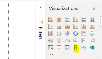
In Power BI Desktop, you will see the R visualization type under Visualizations:
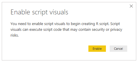
Selecting it, we see the message to Enable script visuals. Note the warning and click Enable if you want to proceed:
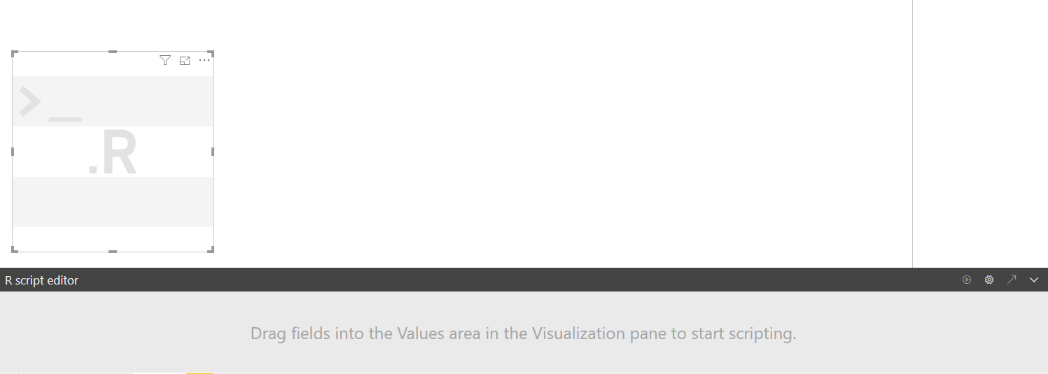
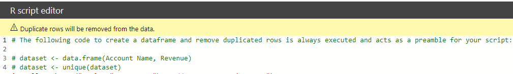
Now we can add R code. We can see in the bottom of the canvas is an R script editor pane:
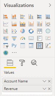
In our dataset, we have 2 fields – Account Name and Revenue. Add those to the fields of the visual:
The following code has now automatically been generated:
# dataset <- data.frame(Account Name, Revenue)
# dataset <- unique(dataset)
# Paste or type your script code here:
[/sourcecode]
Let’s add our code after this, to display a bar chart of Account Name vs Revenue:
[sourcecode language=”R”] # The following code to create a dataframe and remove duplicated rows is always executed and acts as a preamble for your script:# dataset <- data.frame(Account Name, Revenue)
# dataset <- unique(dataset)
library(DT)
datatable(dataset)
plot(datatable)
[/sourcecode]

In the R Script Editor, click the Play button:
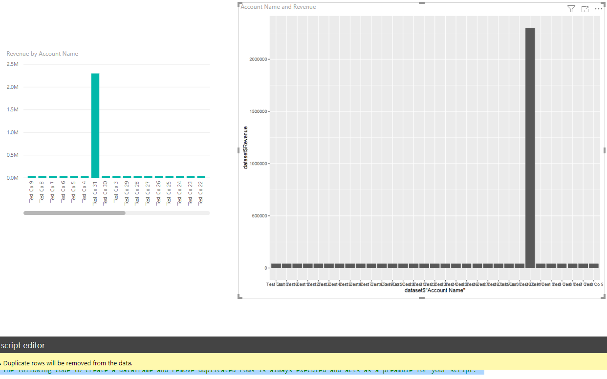
This will display our R Visualization. We can see it is similar to our out of the box Power BI column chart:
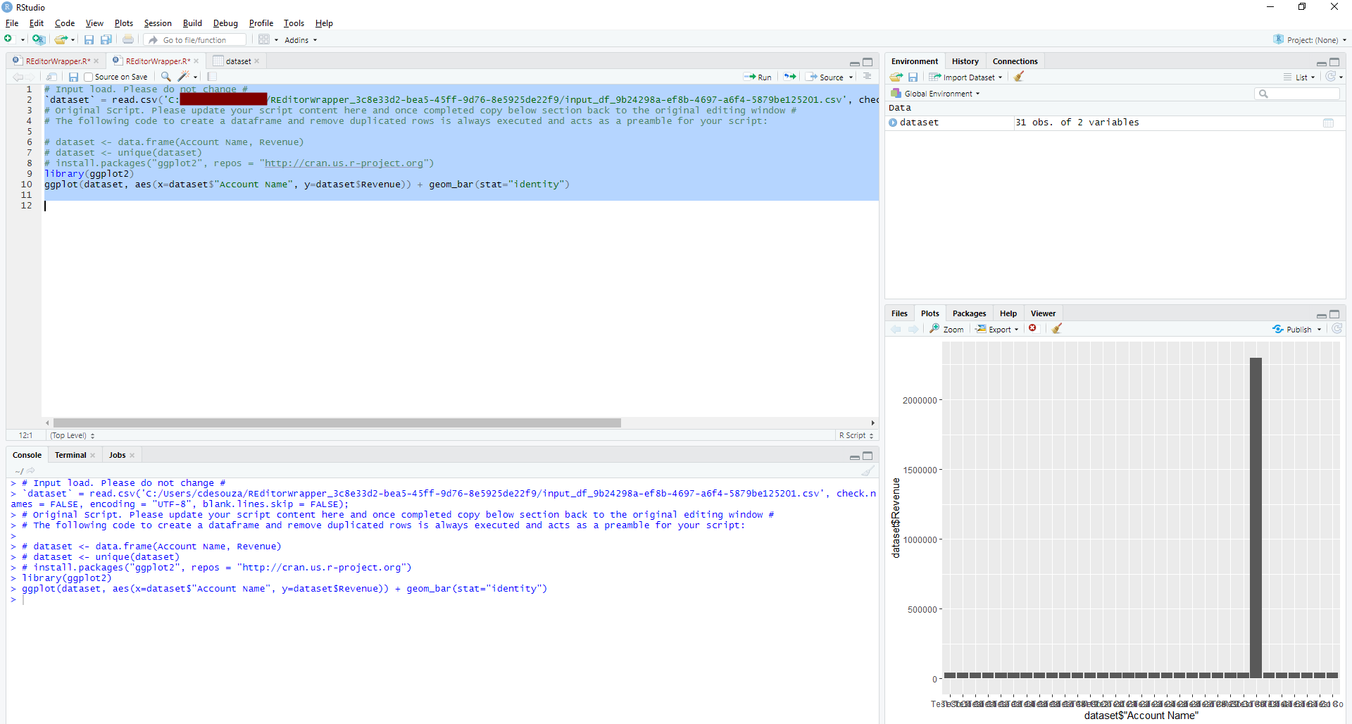
Note you can also run the code inside your IDE, in my case RStudio, by clicking on the arrow in Power BI:
Which opens the script in RStudio. Press Run to run the script and display the chart:
I AM SPENDING MORE TIME THESE DAYS CREATING YOUTUBE VIDEOS TO HELP PEOPLE LEARN THE MICROSOFT POWER PLATFORM.
IF YOU WOULD LIKE TO SEE HOW I BUILD APPS, OR FIND SOMETHING USEFUL READING MY BLOG, I WOULD REALLY APPRECIATE YOU SUBSCRIBING TO MY YOUTUBE CHANNEL.
THANK YOU, AND LET'S KEEP LEARNING TOGETHER.
CARL