In this post, we will look at how to run a simple bar chart in Python. We will use matplotlib.
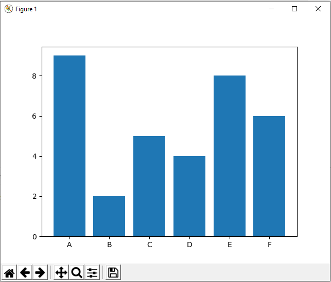
Here’s the code. We will display a chart with x-axis showing “team” data vs y-axis showing “score”:
[sourcecode language=”Python”] import matplotlib.pyplot as pltteam = (‘A’, ‘B’, ‘C’, ‘D’, ‘E’, ‘F’)
score = [9,2,5,4,8,6]
plt.bar(team, score)
plt.show()
[/sourcecode]
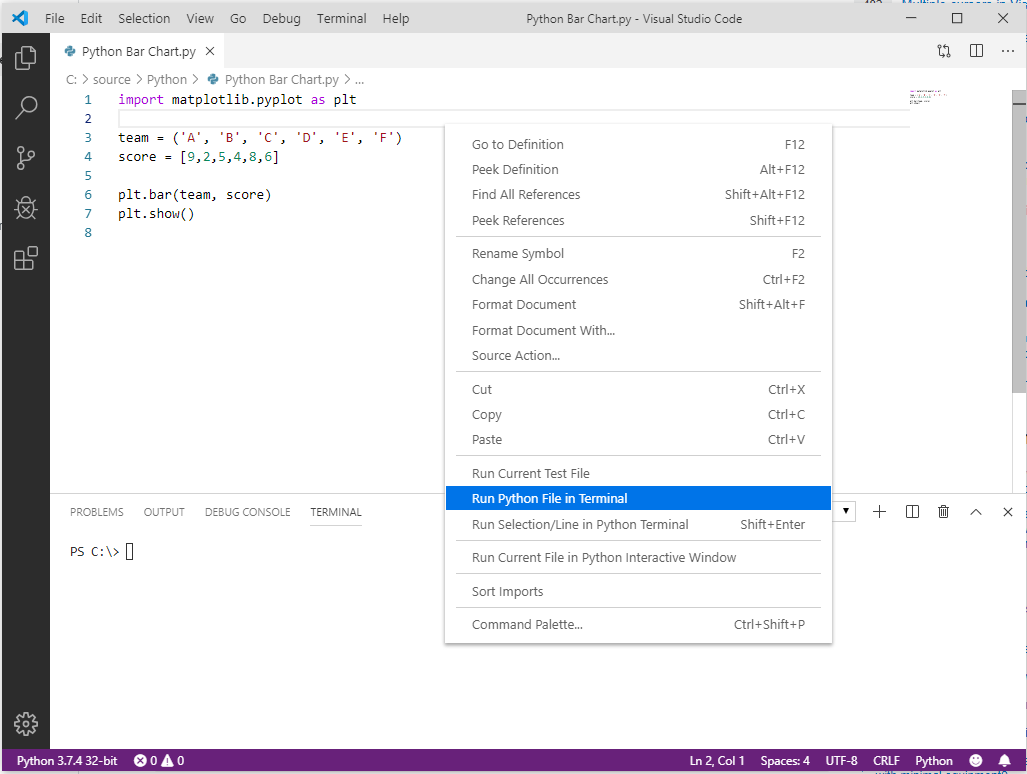
Let’s run this in Visual Studio Code. Save the code with a .py extension, right-click and Run Python File in Terminal:
This will open a bar chart:
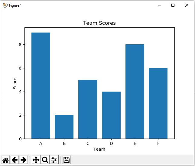
If we want to add labels to the axis and chart, we can use:
[sourcecode language=”Python”] import matplotlib.pyplot as pltteam = (‘A’, ‘B’, ‘C’, ‘D’, ‘E’, ‘F’)
score = [9,2,5,4,8,6]
plt.xlabel(‘Team’)
plt.ylabel(‘Score’)
plt.title(‘Team Scores’)
plt.bar(team, score)
plt.show()
[/sourcecode]
This displays:
I AM SPENDING MORE TIME THESE DAYS CREATING YOUTUBE VIDEOS TO HELP PEOPLE LEARN THE MICROSOFT POWER PLATFORM.
IF YOU WOULD LIKE TO SEE HOW I BUILD APPS, OR FIND SOMETHING USEFUL READING MY BLOG, I WOULD REALLY APPRECIATE YOU SUBSCRIBING TO MY YOUTUBE CHANNEL.
THANK YOU, AND LET'S KEEP LEARNING TOGETHER.
CARL