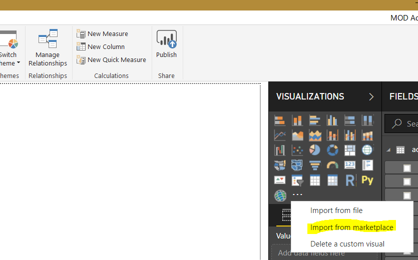
To install the Table Heatmap Visual by Microsoft for Power BI, first open Power BI Desktop, and under Visualizations, select Import from marketplace:
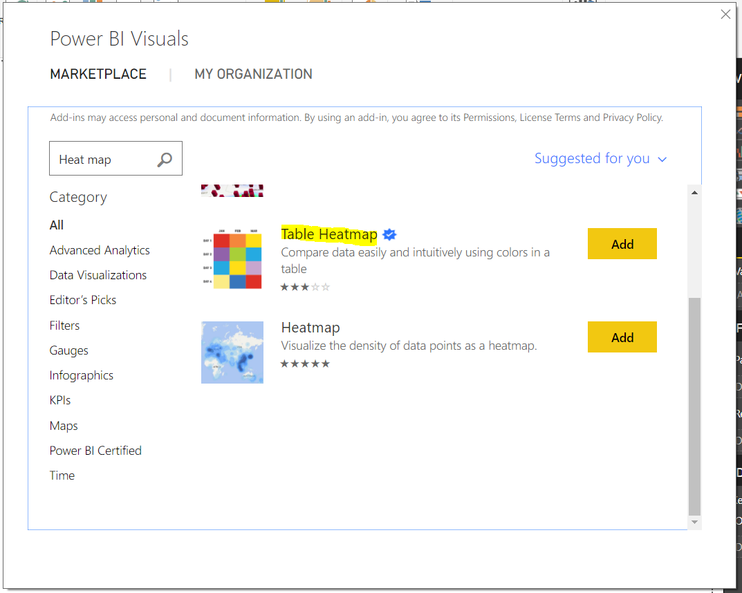
Find the Table Heatmap and click Add:
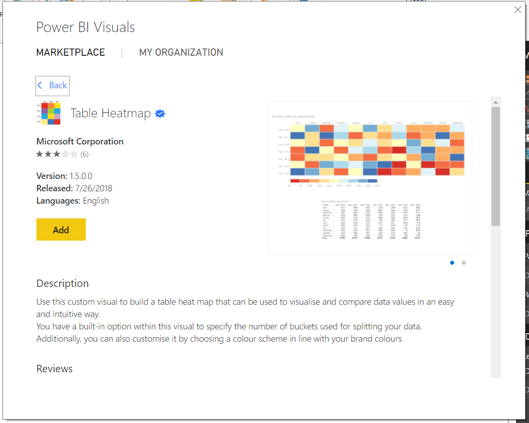
Click Add again:
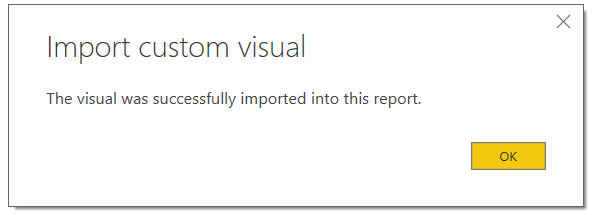
Click OK, the visualization is now imported:
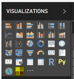
Now under Visualizations, you will see the new Table Heatmap icon:
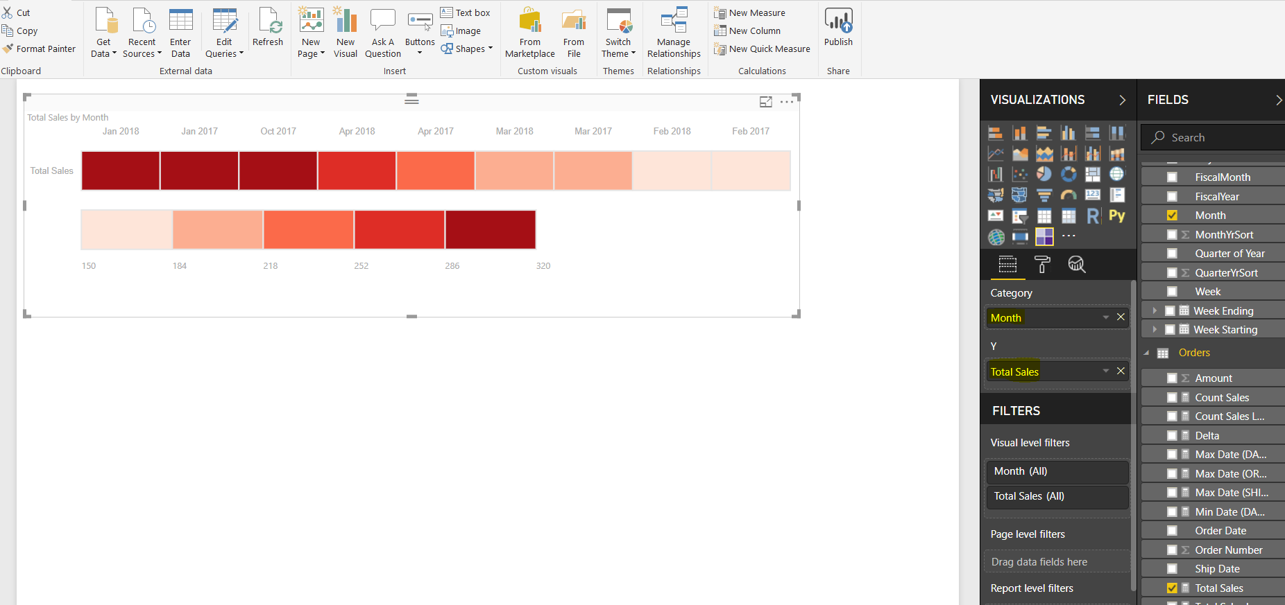
Select it, and add a Category and Y. We will select the Category as our Month, and the Y as our Total Sales. We will be able to see how our total sales look per month:
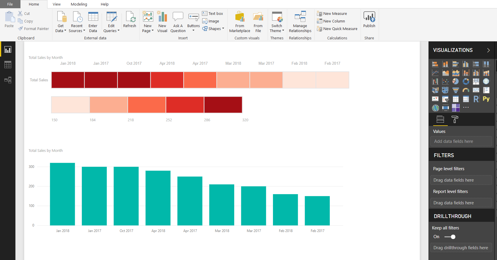
We can compare the results to a Column chart. The higher months for the heat map have darker colors:
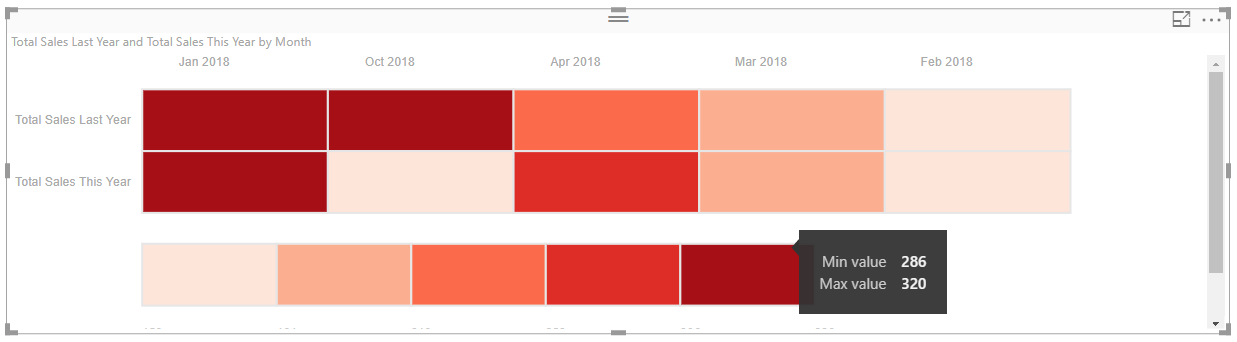
We can compare multiple sources, such as Total Sales Last Year and Total Sales This Year, and zoom over the table map to see the minimum and maximum values:
I AM SPENDING MORE TIME THESE DAYS CREATING YOUTUBE VIDEOS TO HELP PEOPLE LEARN THE MICROSOFT POWER PLATFORM.
IF YOU WOULD LIKE TO SEE HOW I BUILD APPS, OR FIND SOMETHING USEFUL READING MY BLOG, I WOULD REALLY APPRECIATE YOU SUBSCRIBING TO MY YOUTUBE CHANNEL.
THANK YOU, AND LET'S KEEP LEARNING TOGETHER.
CARL