Customer Service workspace (CSw) in Dynamics 365 has a new upgraded live chat widget (LCW). For users of CSw with Omnichannel, the original chat widget had some basic customization abilities. The new 2.0 widget has much deeper customization functionality including being able to customize the header, footer, colors, size, position, etc. The idea is so companies using the widget can fully reflect their branding by styling the widget accordingly.
Let’s look at the new 2.0 widget and how to use and customize it.
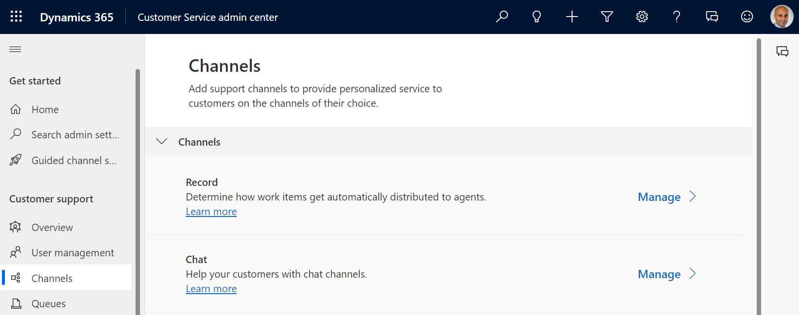
First, let’s go to the Customer Service admin center app and create a new chat channel.
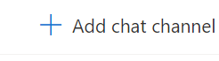
Select Add chat channel:
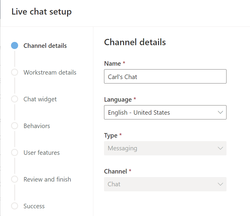
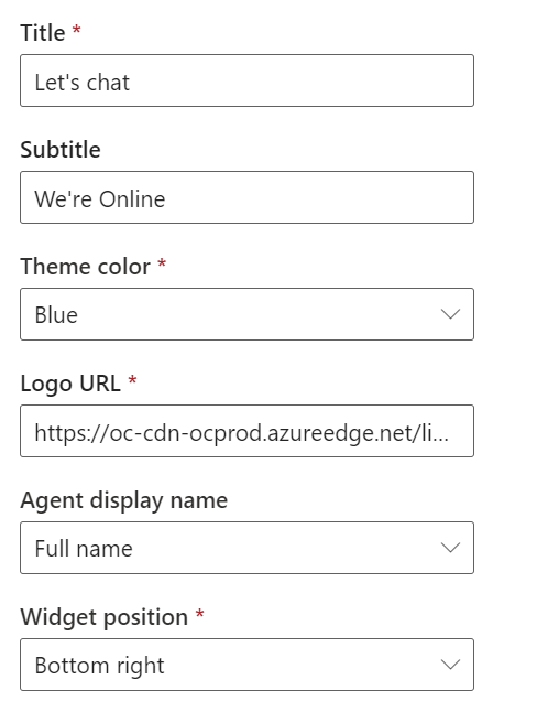
Enter the channel information. We will keep defaults for all of the settings, then create the channel:
Once created, we see the code for Live Chat Widget 2.0 Script. Note the v2 in the script code, that is how you know you are using the widget:
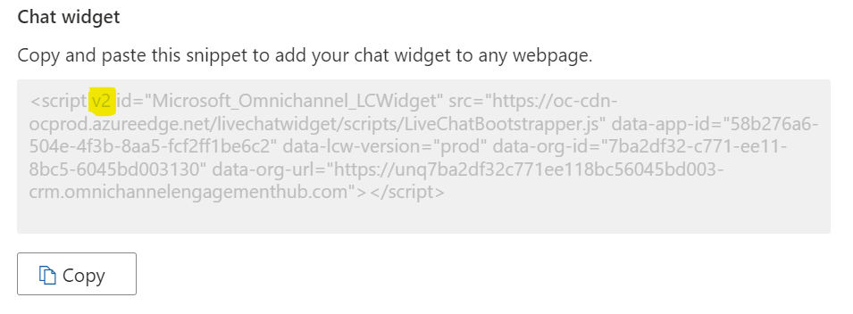
Note also that the v1 widget (i.e. the widget without the v2 tag) no longer appears as an option when chats are created (your environment may vary, I have Wave 2, 2023 installed).
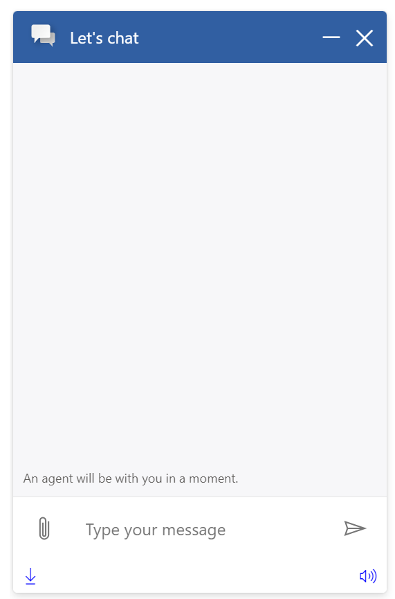
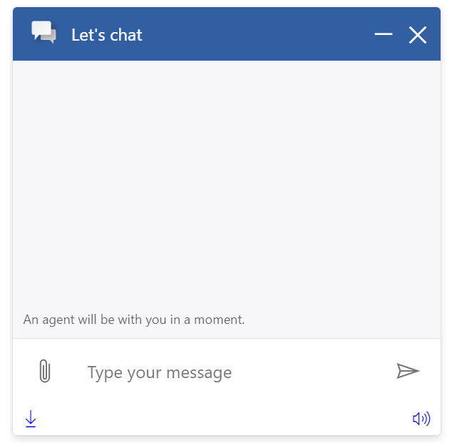
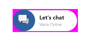
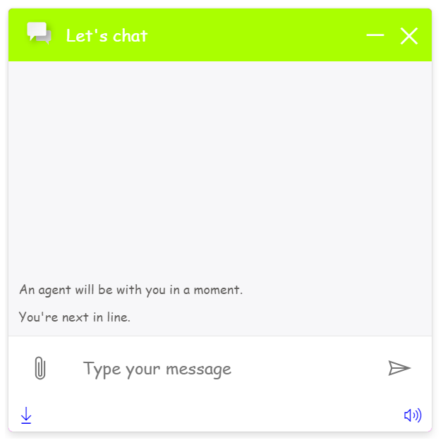
Let’s copy the script code and add it to an HTML file and open the file. We see the chat widget displayed, and it looks just like the v1 widget:
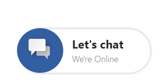
And let’s open it to see what it looks like out of the box:
At this point, it looks basically the same as the Chat Widget 1.0. In the admin interface we can see the same customizations as before.
However v2’s power comes from customizations outside of the UI.
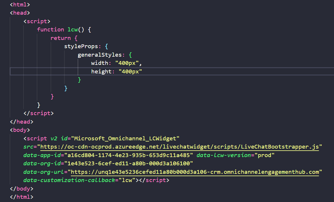
Let’s open the HTML code and add a tag for data-customization-callback=”lcw”. This will call our function called lcw, and we will also create the function.
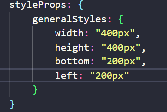
We can set and return various properties regarding the widget. Let’s start with the general styles. Our function itself will return styleProps with generalStyles setting the width and height of our widget to 400×400:
Now if we refresh our widget, we see it is opening at 400px by 400px:
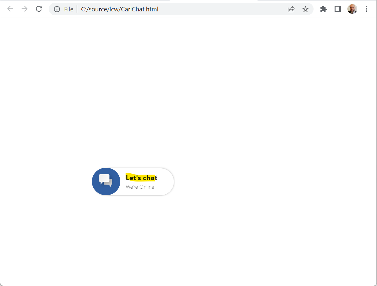
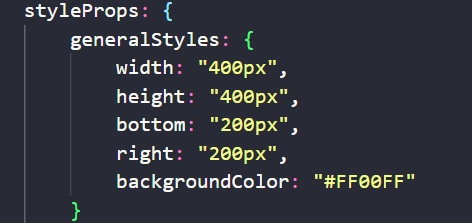
Now let’s position it so it’s not in the bottom right. We will change the position to be 200px from the bottom and 200px from the left (or we can put right here):
The widget is now displayed as shown:
We can change the backgroundColor by:
Now, if you want to set the overall font and color of the chat widget, you can do so back on the chat widget script with:
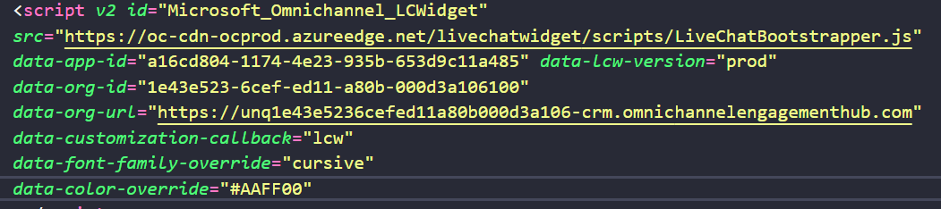
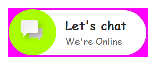
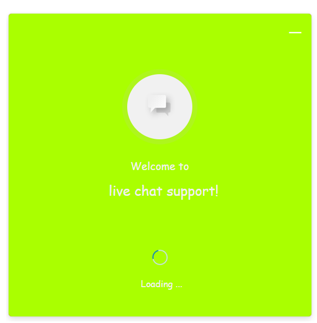
Note the lime color here is used in several areas of the widget, and we see the cursive font used:
Now, let’s move from generalStyles onto the chatButtonProps. This is the actual button itself that a user would click on.
We can set various properties, including:
- background-color
- background-image (the default is the “chat” icon image)
- background-position
- background-size
- border-color
- border radius (percentage), this makes the “circle”
- border-style (solid etc)
- border-width
- height
- width
- margin
And we can:
- hideChatTitle (true/false)
- hideChatTextContainer (true/false)
There’s also a bunch of other props such as headerProps, footerProps, loadingPaneProps, outOfOfficeProps, etc.
There looks like a lot of customizations available so companies can really make the widget branded per their corporate identity.
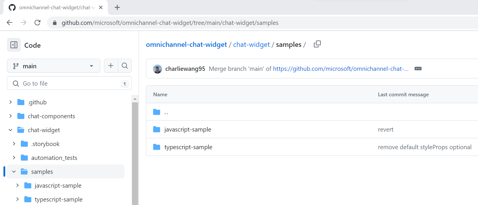
Heading over to GitHub, there are a couple of samples created by Microsoft that can be downloaded here, a JavaScript sample and a Typescript sample:
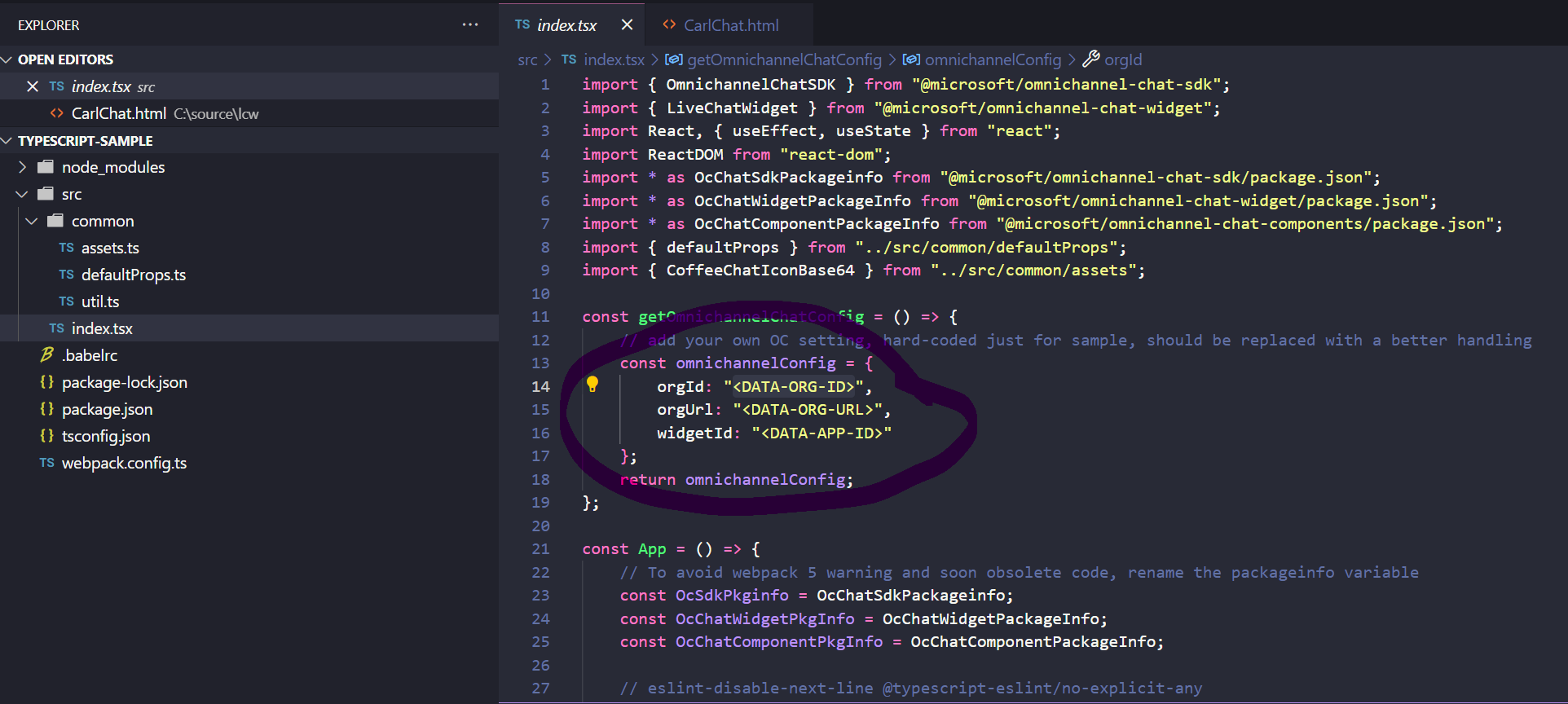
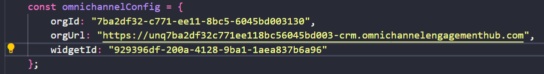
Let’s open the Typescript sample which is built on React in Visual Studio Code and run npm install, then open the index.tsx file and update the 3 parameters from your script widget, the orgId, orgUrl and widgetId (you can get these from the chat widget code snippet from the admin portal):
Save the file and run npm run build.
You may need to navigate through errors specific to your environment. I had to run npm install react-native.
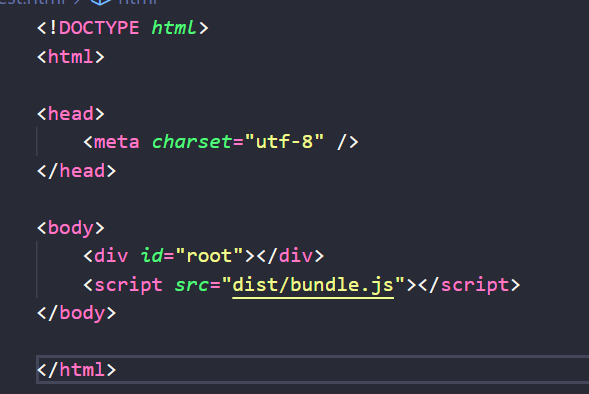
Once you get a clean build, you can create an HTML file like below, referencing the bundle.js file that is created:
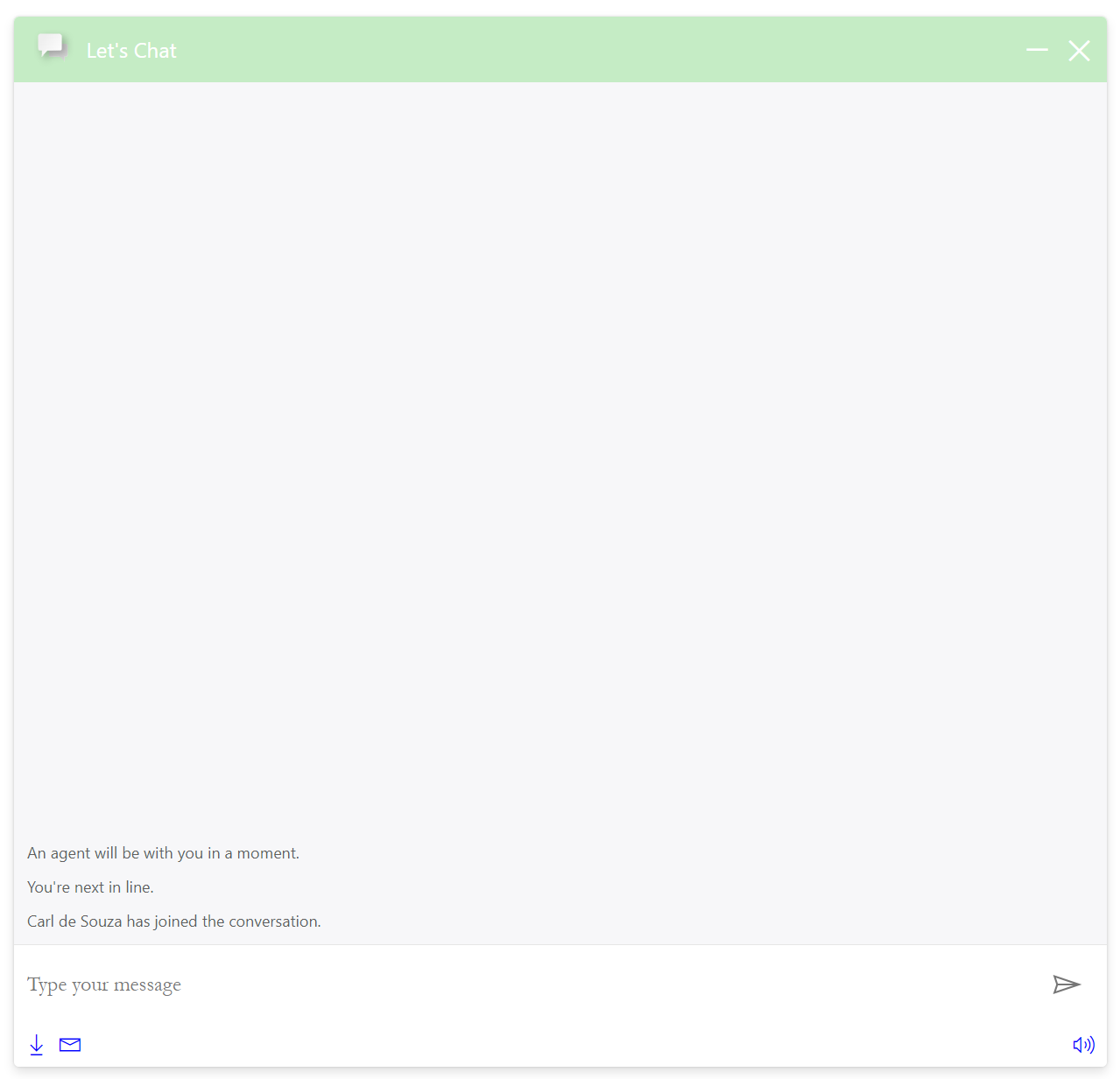
Opening this file, we see our sample chat widget:
Check out the doc Using LiveChatWidget in React + TypeScript + Webpack 5.
This new feature should really help to make the widget look less generic and more integrated into an organization’s site.
I AM SPENDING MORE TIME THESE DAYS CREATING YOUTUBE VIDEOS TO HELP PEOPLE LEARN THE MICROSOFT POWER PLATFORM.
IF YOU WOULD LIKE TO SEE HOW I BUILD APPS, OR FIND SOMETHING USEFUL READING MY BLOG, I WOULD REALLY APPRECIATE YOU SUBSCRIBING TO MY YOUTUBE CHANNEL.
THANK YOU, AND LET'S KEEP LEARNING TOGETHER.
CARL