Unified Service Desk can use custom layouts, so organizations can specify the layout of the USD application. Let’s look at how to do this.
First, install the Dynamics CRM SDK Templates for Visual Studio.
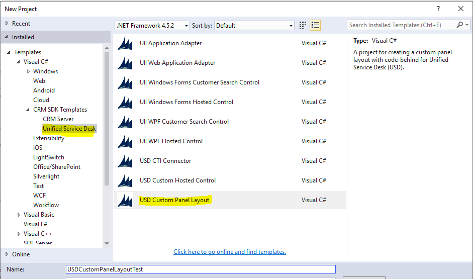
Once installed, start Visual Studio and create a new project of type USD Custom Panel Layout:
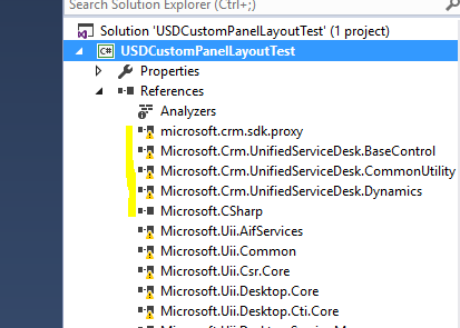
When the project loads, you will see missing references:
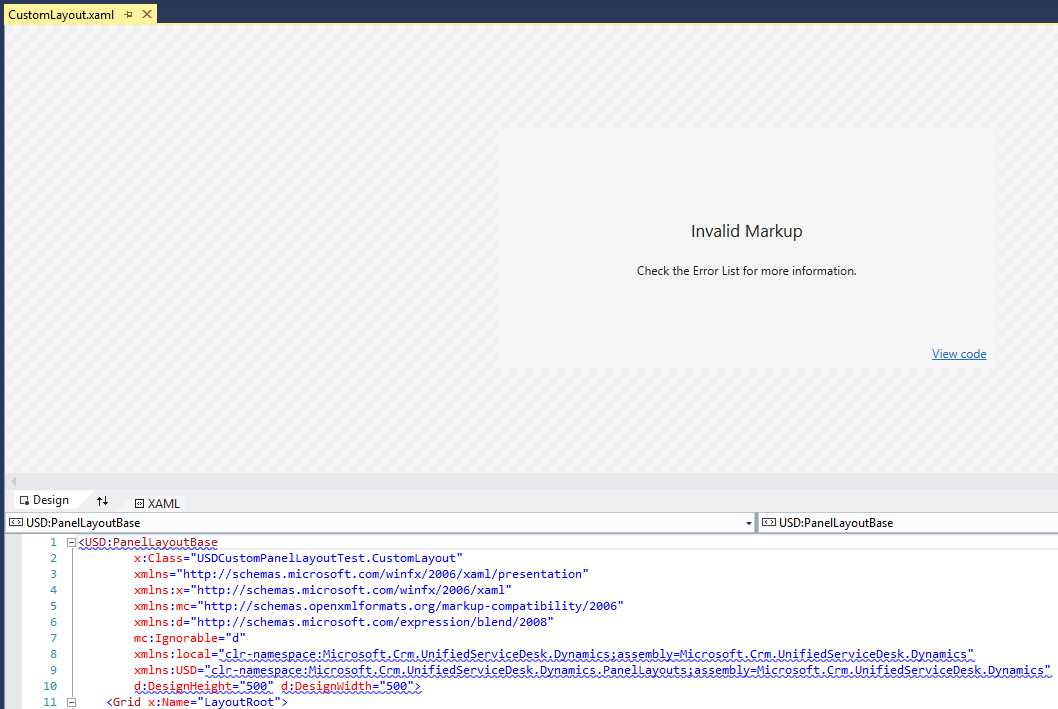
With Invalid Markup displaying:
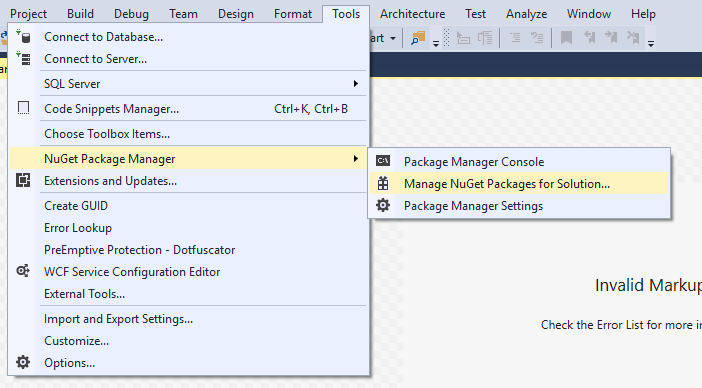
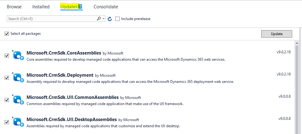
Open the NuGet packages:
Install any updates:
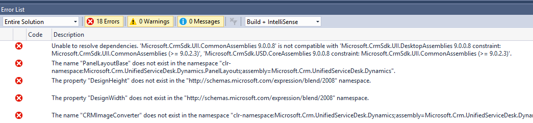
You may see some errors but these can be ignored:
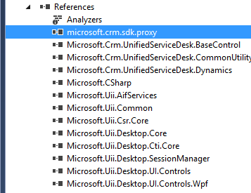
The references will be updated:
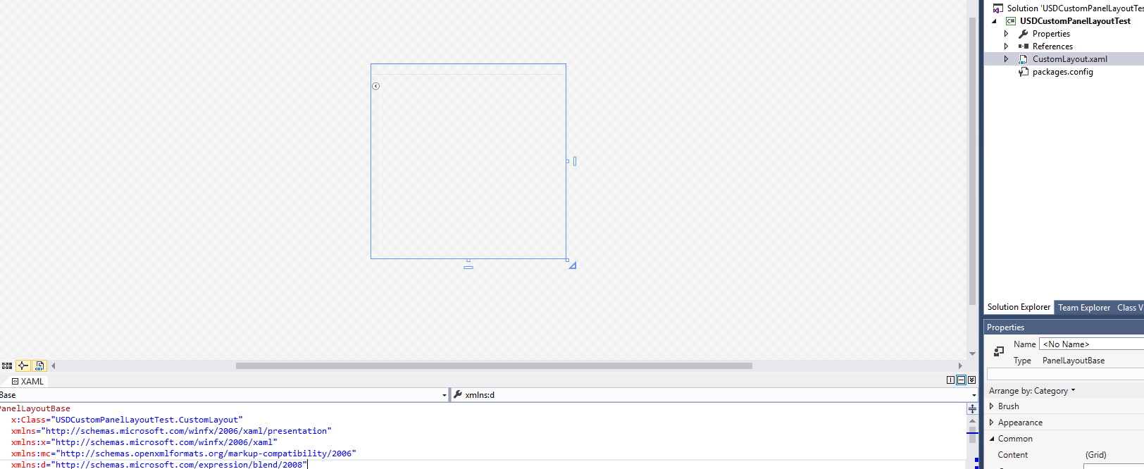
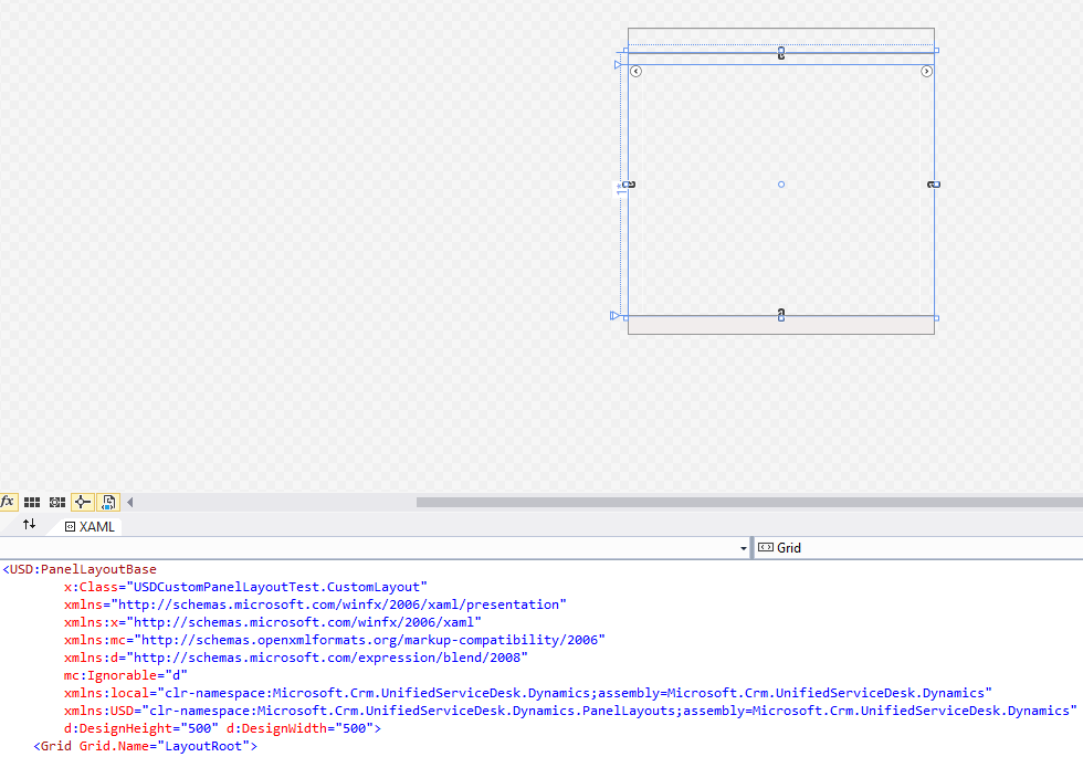
Build the solution and reopen the CustomLayout.xaml. It will now display:
Now look at the XAML:
[sourcecode language=”XML”] <USD:PanelLayoutBase x:Class="USDCustomPanelLayoutTest.CustomLayout" xmlns="http://schemas.microsoft.com/winfx/2006/xaml/presentation" xmlns:x="http://schemas.microsoft.com/winfx/2006/xaml" xmlns:mc="http://schemas.openxmlformats.org/markup-compatibility/2006" xmlns:d="http://schemas.microsoft.com/expression/blend/2008" mc:Ignorable="d" xmlns:local="clr-namespace:Microsoft.Crm.UnifiedServiceDesk.Dynamics;assembly=Microsoft.Crm.UnifiedServiceDesk.Dynamics" xmlns:USD="clr-namespace:Microsoft.Crm.UnifiedServiceDesk.Dynamics.PanelLayouts;assembly=Microsoft.Crm.UnifiedServiceDesk.Dynamics" d:DesignHeight="500" d:DesignWidth="500"><Grid x:Name="LayoutRoot">
<Grid.Resources>
<local:CRMImageConverter x:Key="CRMImageLoader" />
<Style x:Key="ImageLogo" TargetType="{x:Type Image}">
<Setter Property="FlowDirection" Value="LeftToRight"/>
<Setter Property="Width" Value="161" />
<Setter Property="Height" Value="25" />
<Setter Property="Margin" Value="0" />
<Setter Property="HorizontalAlignment" Value="Left" />
<Setter Property="VerticalAlignment" Value="Center" />
</Style>
</Grid.Resources>
<Grid.RowDefinitions>
<RowDefinition Height="auto"/>
<RowDefinition Height="*"/>
<RowDefinition Height="auto"/>
</Grid.RowDefinitions>
<Border Grid.Row="0" BorderBrush="#d8d8d8" BorderThickness="0,1,0,1">
<Grid Background="{DynamicResource WindowHeaderStyle}" Grid.Row="0" Margin="0">
<Grid.ColumnDefinitions>
<ColumnDefinition Width="auto" />
<ColumnDefinition Width="auto" />
<ColumnDefinition Width="*" />
<ColumnDefinition Width="Auto" />
</Grid.ColumnDefinitions>
<Image Grid.Column="0" Source="{Binding Source=msdyusd_Logo, Converter={StaticResource CRMImageLoader}}" Style="{DynamicResource ImageLogo}" />
<Rectangle Width="10" Grid.Column="1" />
<USD:USDDeckTabPanel x:Name="ToolbarPanel" Grid.Column="2" AutomationProperties.Name="Toolbar Panel" VerticalAlignment="Stretch" Focusable="False" Margin="1" />
<Grid Grid.Column="3">
<Grid.ColumnDefinitions>
<ColumnDefinition Width="*" />
<ColumnDefinition Width="412"/>
</Grid.ColumnDefinitions>
<Grid.Background>
<ImageBrush ImageSource="{Binding Source=msdyusd_Office15, Converter={StaticResource CRMImageLoader}}" Stretch="Fill" ></ImageBrush>
</Grid.Background>
<USD:USDStackPanel Grid.Column="0" x:Name="CtiPanel" Orientation="Horizontal" Focusable="False" VerticalAlignment="Center" AutomationProperties.Name="Cti Panel" SelectedAppChanged="SelectedAppChangedHander"/>
<USD:USDStackPanel Grid.Column="1" HorizontalAlignment="Right" x:Name="AboutPanel" Orientation="Horizontal" Focusable="False" VerticalAlignment="Center" AutomationProperties.Name="AboutPanel"/>
</Grid>
</Grid>
</Border>
<Grid Grid.Row="1" VerticalAlignment="Stretch" Margin="0" Background="{DynamicResource WindowBackgroundStyle}">
<Grid.RowDefinitions>
<RowDefinition Height="auto" />
<RowDefinition Height="*" />
<RowDefinition Height="auto" />
</Grid.RowDefinitions>
<USD:USDDeckTabPanel x:Name="SessionTabsPanel" Grid.Row="0" Margin="5,5,0,5" AutomationProperties.Name="Session Tabs Panel" Focusable="False" ClipToBounds="True" />
<Grid x:Name="MainGrid" Grid.Row="1" AutomationProperties.Name="Main Panels">
<Grid.ColumnDefinitions>
<ColumnDefinition Width="auto" />
<ColumnDefinition Width="*"/>
</Grid.ColumnDefinitions>
<Expander Grid.Column="0" Style="{DynamicResource StretchExpanderStyle}" ExpandDirection="Left" x:Name="LeftExpander" IsExpanded="false" BorderBrush="White" Expanded="Expander_Expanded" Collapsed="Expander_Collapsed" >
<Grid Style="{DynamicResource LeftPanelGrid}">
<Grid.RowDefinitions>
<RowDefinition Height="auto" />
<RowDefinition Height="auto" />
<RowDefinition Height="auto" Name="ChatPanelRow" />
<RowDefinition Height="auto" />
<RowDefinition Height="auto" />
<RowDefinition Height="*" />
</Grid.RowDefinitions>
<USD:USDCollapsePanel x:Name="SessionExplorerPanel" AutomationProperties.Name="Session Explorer Panel" Grid.Row="0" Margin="1" SelectedAppChanged="SelectedAppChangedHander" />
<USD:USDCollapsePanel x:Name="WorkflowPanel" AutomationProperties.Name="Workflow Panel" Grid.Row="1" Margin="1" SelectedAppChanged="SelectedAppChangedHander" />
<USD:USDCollapsePanel x:Name="ChatPanel" AutomationProperties.Name="Workflow Panel" Grid.Row="2" Margin="1" SelectedAppChanged="SelectedAppChangedHander"/>
<USD:USDCollapsePanel x:Name="LeftPanel1" AutomationProperties.Name="Left Panel 1" Grid.Row="3" Margin="1" SelectedAppChanged="SelectedAppChangedHander"/>
<USD:USDCollapsePanel x:Name="LeftPanel2" AutomationProperties.Name="Left Panel 2" Grid.Row="4" Margin="1" SelectedAppChanged="SelectedAppChangedHander"/>
<USD:USDDeckTabPanel x:Name="LeftPanelFill" AutomationProperties.Name="Left Panel Fill" Grid.Row="5" Margin="1" SelectedAppChanged="SelectedAppChangedHander"/>
</Grid>
</Expander>
<Grid Grid.Column="1" Background="Transparent">
<Grid.RowDefinitions>
<RowDefinition Height="0" />
<RowDefinition Height="*" />
</Grid.RowDefinitions>
<USD:USDCollapsePanel x:Name="RibbonPanel" Grid.Row="0" Visibility="Collapsed" AutomationProperties.Name="Ribbon Panel" Focusable="False" Margin="1" ClipToBounds="False" SnapsToDevicePixels="True" />
<USD:USDTabPanel x:Name="MainPanel" Grid.Row="1" AutomationProperties.Name="Main Panel" SelectedAppChanged="SelectedAppChangedHander"/>
</Grid>
</Grid>
</Grid>
<StatusBar Margin="0" Background="{DynamicResource WindowHeaderStyle}" Grid.Row="2" Height="auto" VerticalAlignment="Bottom">
<StatusBarItem Background="{DynamicResource WindowHeaderStyle}" >
<USD:USDStackPanel x:Name="StatusPanel" Orientation="Horizontal" AutomationProperties.Name="Status Panel" Margin="1" SelectedAppChanged="SelectedAppChangedHander" />
</StatusBarItem>
</StatusBar>
</Grid>
</USD:PanelLayoutBase>
[/sourcecode]
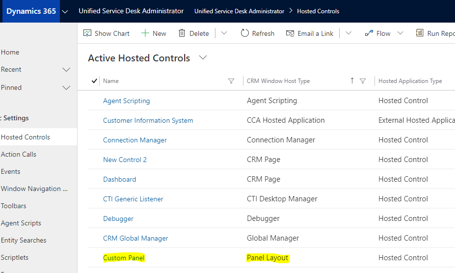
Now, let’s look at the USD Configuration. Go to Hosted Controls and find the hosted control that is of type Panel Layout:
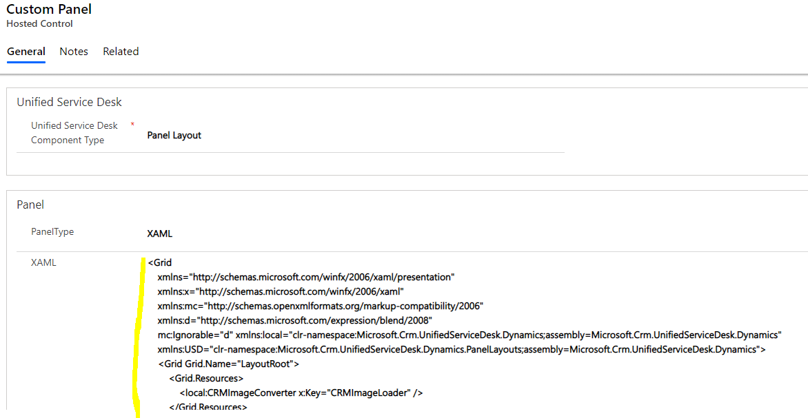
We see the custom XAML being used here:
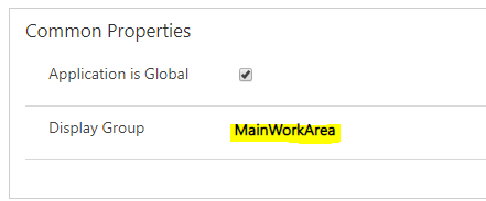
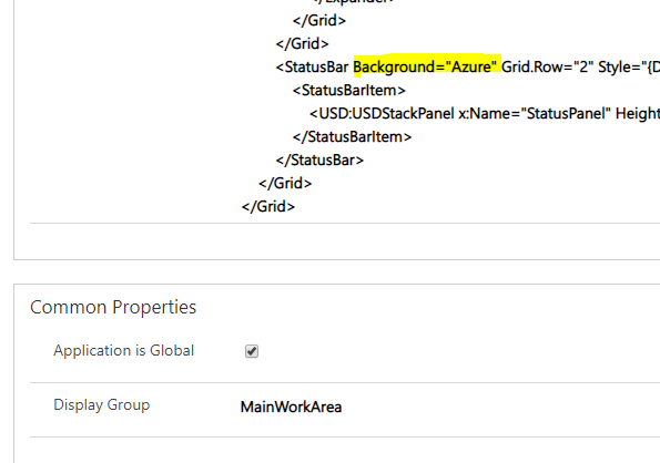
And as the DisplayGroup is set to MainWorkArea, it is used to define the USD layout:
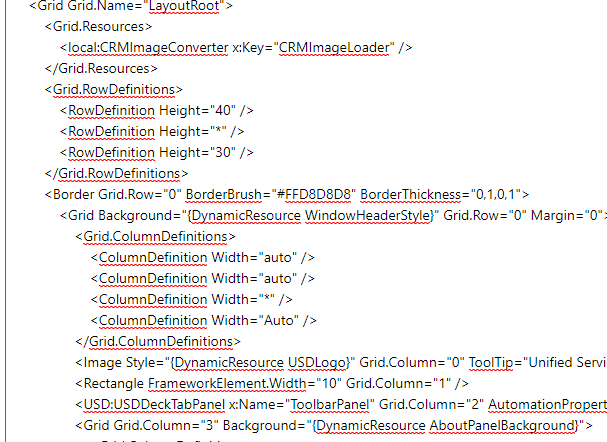
Let’s copy the Grid LayoutRoot XAML from the USD configuration to the Visual Studio project:
We can now use Visual Studio to style USD:
Let’s change the color of the status bar at the bottom of USD. We will set the color to “Azure blue”:
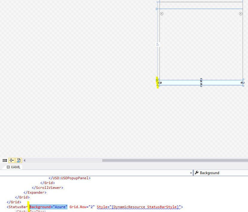
Let’s copy this up to our Custom Panel layout in the USD configuration:
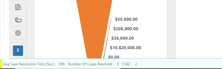
And restart USD. We see the new design has been applied:
We can do more with the XAML such as changing the entire layout of the USD app.
I AM SPENDING MORE TIME THESE DAYS CREATING YOUTUBE VIDEOS TO HELP PEOPLE LEARN THE MICROSOFT POWER PLATFORM.
IF YOU WOULD LIKE TO SEE HOW I BUILD APPS, OR FIND SOMETHING USEFUL READING MY BLOG, I WOULD REALLY APPRECIATE YOU SUBSCRIBING TO MY YOUTUBE CHANNEL.
THANK YOU, AND LET'S KEEP LEARNING TOGETHER.
CARL

When i am using this the margin between Main panel and Right panel is also increasing exponentially. What could be the reason?